I started to share 25 Javascript tricks and solutions you need to know about which were well received so I decided to share some CSS tricks as well. I really believe that a lot of people adopt a library or framework because they want a solution but are not aware of how simple these solutions can be. I am constantly sharing tricks so follow my YouTube channel for video tutorials.
1 — Truncate with Ellipsis (single line)
单行文本省略
If you want to maintain a single line of text but want to show 3 dots(ellipsis) at the end in case the text ends up being too big, you need this trick. This is one of the examples which illustrate a bad CSS API design due to the fact you need all these combinations of properties for this to work.
The element must be a block or inline-block, the text-overflow does not work without the overflow being hidden and the element must have a defined width or a max-width set. The white-space value of nowrap (reads No Wrap not Now Rap) simply forces the text not to break into a new line
p {
  /* use max-width so the ellipsis
  only shows when reached that size */
  max-width: 200px;
  overflow: hidden;
  white-space: nowrap;
  text-overflow: ellipsis;
  display: inline-block;
}
<div class="box"> 予观夫巴陵胜状,在洞庭一湖.衔远山,吞长江,浩浩汤汤,横无际涯,朝晖夕阴,气象万千,此则岳阳楼之大观也,前人之述备矣.然则北通巫峡,南极潇湘,迁客骚人,多会于此,览物之情,得无异乎? </div>
.box {
  background-color: #fff;
  box-shadow: 2px 2px 10px #246756;
  overflow: hidden;
  padding: 2em;
  /* */
  text-overflow: ellipsis;
  white-space: nowrap;
  width: 400px;
}
2 — Truncate with an ellipsis (multiple lines)
多行文本省略
If you want ellipsis on multiple lines there is an entire, weird CSS solution to this. You can check this article on CSS-Tricks for more alternative options and details.
p {
  /* old display option */
  display: -webkit-box;
  -webkit-box-orient: vertical; /* max number of lines to show */
  -webkit-line-clamp: 3; /* needed for it to work */
  overflow: hidden;
}
<p>予观夫巴陵胜状,在洞庭一湖.衔远山,吞长江,浩浩汤汤,横无际涯,朝晖夕阴,气象万千,此则岳阳楼之大观也,前人之述备矣.然则北通巫峡,南极潇湘,迁客骚人,多会于此,览物之情,得无异乎?</p>
p {
  width: 400px;
  display: -webkit-box;
  -webkit-box-orient: vertical;
  -webkit-line-clamp: 3;
  overflow: hidden;
}
3 — Center vertically
垂直居中
The options to center vertically are vast depending on your situation really. Let’s look at a few of my favorites which do not include some other weird or, in my opinion, unmaintainable hacks.
Vertically center anything inside a display flex container:
弹性布局容器内垂直居中
.flex-vertically-center {
  display: flex;
  align-items: center;
}Vertical alignment an inline, inline-block, or table-cell box:
行内元素垂直居中
img {
  /* only for block tags */
  display: inline-block;
  vertical-align: middle;
}Vertically center absolute element inside a relative container:
相对定位容器内绝对定位垂直居中
.container {
  position: relative;
}
.element {
  /* change to fixed to center relative to the view */
  position: absolute;
  top: 50%;
  transform: translateY(-50%);
}
4 — Center horizontally
🔥 水平居中
Similar to vertically align you will need to align things horizontally as well. These are my favorite minus the weird stuff.
Center block items:
块级元素水平居中
.block-element {
  margin: 0 auto;
  /* use display only if element is not block already */
  display: block;
}
Center text and inline or inline-block elements:
行内元素水平居中
.container {
  text-align: center;
}
Horizontally center absolute element inside a relative container:
相对定位容器内绝对定位水平居中
.container {
  position: relative;
}
.element {
  /* change to fixed to center relative to the view */
  position: absolute;
  left: 50%;
  transform: translateX(-50%);
}
Horizontally center anything inside a display flex container:
弹性布局容器内水平居中
.flex-vertically-center {
  display: flex;
  justify-content: center;
}
Horizontally center anything inside a display grid container:
网格布局容器内水平居中
.flex-vertically-center {
  display: grid;
  justify-content: center;
}
justify-content属性定义了分配顺着弹性容器主轴的元素之间及其周围的空间。
5 — Style next or previous siblings
修改同级元素样式
I don’t know about you. but I came across many situations in which I needed to style the elements after and before a certain element. The after is pretty simple and the before will blow your mind.
Let pretend you have a container with 10 buttons and the 5th has a class of “current”. To style all the buttons after “current” you do:
.current ~ button {
  /* the style you want */
}
<div> <button>0</button> <button>1</button> <button>2</button> <button>3</button> <button class="current">4</button> <button>5</button> <button>6</button> <button>7</button> <button>8</button> <button>9</button> </div>
.current ~ button {
   background: red;
}
.current + button {
  /* the style you want */
}
<div> <button>0</button> <button>1</button> <button>2</button> <button>3</button> <button class="current">4</button> <button>5</button> <button>6</button> <button>7</button> <button>8</button> <button>9</button> </div>
.current + button {
   background: red;
}
CSS does not have a “previous“ selector but we can take advantage of its cascading nature to use the order to do this. Since we already know how to target all the elements after, we can style all the buttons we want the buttons before “current” to have then we overwrite this style to look normal. The below code will make only the buttons before “current” have a red background.
button {
  background: red;
}
.current,
.current ~ button {
  background: initial;
}
<div> <button>0</button> <button>1</button> <button>2</button> <button>3</button> <button class="current">4</button> <button>5</button> <button>6</button> <button>7</button> <button>8</button> <button>9</button> </div>
button {
  background: red;
}
.current,
.current ~ button {
  background: initial;
}
6 — Style elements in a specific range
修改同级范围内元素样式
You can target a certain range of elements to style as well. For example, you have 10 boxes and want the second to the fifth box to have a red background and all the others to have a green background, then you do:
.box:nth-of-type(n + 2):nth-of-type(-n + 5) {
  background: red;
}
<div> <button>0</button> <button>1</button> <button>2</button> <button>3</button> <button class="current">4</button> <button>5</button> <button>6</button> <button>7</button> <button>8</button> <button>9</button> </div>
button:nth-of-type(n + 2):nth-of-type(-n + 5) {
  background: red;
}
The above works with nth-of-type and nth-child pseudo-class.
7 — box-sizing
元素的总宽度和总高度
One thing that used to drive me crazy was that I set an element to be for example 200px and then in the browser, it would be something else because of padding or border, then I found out about box-sizing.
The following will create a box that is 240 by 240(adds padding to width and height):
.box {
  width: 200px;
  height: 200px;
  background: #eee;
  padding: 20px;
}
The following will create a box that is 200 by 200(includes padding and border into the size I set):
.box {
  width: 200px;
  height: 200px;
  background: #eee;
  padding: 20px;
  box-sizing: border-box;
}This is why on all my CSS tutorial videos You hear me mention setting the following:
Targets all elements and pseudo-elements*,
*::after,
*::before {
  box-sizing: border-box;
}
8 — aspect ratio
长宽比
If you want for a box to have a certain width to height ratio you can go about it several ways and only one of them is obvious. If you want to make a box a certain ratio you can set the top padding using a (height * width) / 100% formula using the calc function. To set a limit on the width you put inside a container where you set the width.
Create a 16 by 9 rectangle of 200px wide:
.container {
  width: 200px;
}
.box {
  padding-top: calc((9 / 16) * 100%);
  background: #eee;
}
You can also use the after pseudo-element to create the ratio size
.container {
  width: 200px;
}
.box::after {
  content: '';
  display: block;
  padding-top: calc((9 / 16) * 100%);
  background: #eee;
}
The issue with that is that everything inside must be shifted up or absolutely positioned to the box. Fortunately, CSS gave us the aspect-ratio property we can use, and unfortunately, it has very poor support as of 2020.
.box {
  aspect-ratio: 16 / 9;
}
9 — text around an image
文本围绕图片
Text wrapping around the image is super cool and probably one of the most underrated CSS features ever and it is super easy to do. We use the float property to float the image inside a text then we use the powerful shape-outside property with the image URL. The float property already does a lot but the shape-outside will escape pixels in your image.
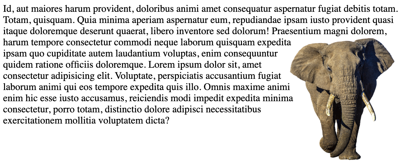
img {
  float: right;
  shape-outside: url(some-url-to-your-image);
}10 — is, matches, any and :where
将选择器列表作为参数,并选择该列表中任意一个选择器可以选择的元素。
CSS has the :matches pseudo-class function which was recently renamed to :is and in some old browsers it is named :any ** (with prefix) but they all work exactly the same. What this allows you to do is simplify your CSS selectors, for example, you can change this:
section h1,
article h1,
aside h1,
nav h1 {
  font-size: 25px;
}
into this:
:is(section, article, aside, nav) h1 {
  font-size: 25px;
}
The :where works similarly but the specificity is always zero where the :is specificity is of the overall selector. You can read more on the MDN page.
Conclusion
CSS is fun and powerful and it is constantly growing and improving. I have collected a lot of tricks over the years and by doing things yourself you are constantly learning and enjoying the experience of discovery.
I will continue to share more tricks in the article and video format so let’s stay in touch so I can continue to share my experience with you.