Continuing our series on CSS tricks where you should probably read about the first one , I have collected more tricks that have the potential to blow your mind and ask why you never knew about them before.
1 — Check for user color theme preference
切换主题
If you ever need to detect whether the user prefers dark or light mode to style your site accordingly, CSS gives you this ability through the media query API.
[@media] (prefers-color-scheme: dark) {
  // your code for dark mode here
}2 — Text tooltips
CSS tooltips are easy and if pla n ned and use right, can do a whole lot for you. The limitation is that they can only show text but I went over so many details in a video dedicated to this where I demonstrate how to add positioning, theme, and more. But this relies on pseudo-elements and the ability of their content being something you set in an attribute of their parent. Then all you do is the absolute position it and style it.
<button type="button" class="tooltip" data-tip="This css tooltip">I have a Tooltip</button>/* only add tooltip when there is a message */
.tooltip[data-tip]:not([data-tip=''])::before {
content: attr(data-tip);
position: absolute;
background-color: rgba(0, 0, 0, 0.8);
color: #fff;
padding: 15px 10px;
border-radius: 3px;
max-width: 300px;
width: 250%;
left: 50%;
transform: translate(-50%, 0);
bottom: calc(100% + 12px);
}
<p>予观夫巴陵胜状,在洞庭一湖.衔远山,吞长江,浩浩汤汤,横无际涯,朝晖夕阴,气象万千,此则岳阳楼之大观也,前人之述备矣.然则北通巫峡,南极潇湘,迁客骚人,多会于此,览物之情,得无异乎?</p>
p {
  width: 400px;
  display: -webkit-box;
  -webkit-box-orient: vertical;
  -webkit-line-clamp: 3;
  overflow: hidden;
}One thing that actually goes great with a tooltip is the little down arrow pointing to the button with the tooltip (image above). The conversation bubble arrow. It works by removing the width and height of the pseudo-element and adds borders only which with a width and height of zero forms 4 triangles which you can set the color to be transparent and then target a specific one to color, whether the top, right, bottom or left.
.tooltip[data-tip]:not([data-tip=''])::after {
  content: '';
  border-width: 6px;
  border-style: solid;
  border-color: transparent;
  border-top-color: rgba(0, 0, 0, 0.8);
  width: 0;
  height: 0;
  display: inline-block;
  position: absolute;
  left: 50%;
  bottom: 100%;
  transform: translate(-50%, 0);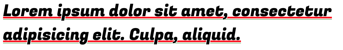
}4 — Custom text underline
If you ever try to customize your text underline you will quickly run out of options and get frustrated. Some websites require custom text underlines as fonts normally don’t help and what you are trying to highlight often gets lost.
There are many ways to accomplish this but it is all about balancing out the pros and cons of each option till you land on a solution that works for you.
This first one uses the power of box and text-shadow to create the effect of underline and if you look closely, the underline even fills the little letter hoops and surrounds the letters gracefully.
.shadow-underline {
  display: inline;
  box-shadow: inset 0 -0.23em white, inset 0 -0.25em green, inset 0 -0.3em white, inset 0 -0.4em red;
  text-shadow: 0.04em 0 white, -0.04em 0 white;
}
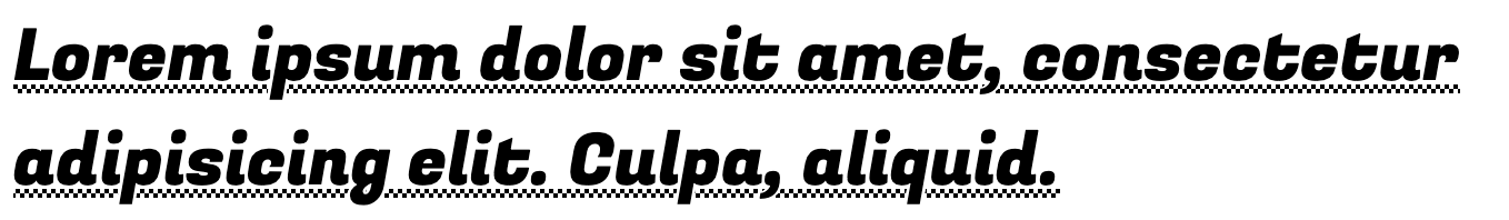
This next option uses the background linear gradient which is the option that allows you to do the most and be more creative.
.custom-underline {
  display: inline;
  background: linear-gradient(90deg, black 50%, white 0) 0 78%/4px 2px repeat-x, linear-gradient(
        90deg,
        white 50%,
        black 0
      ) 0 82%/4px 2px repeat-x;
  text-shadow: 0.04em 0 white, -0.04em 0 white;
}
5 —No HTML for wrapper needed
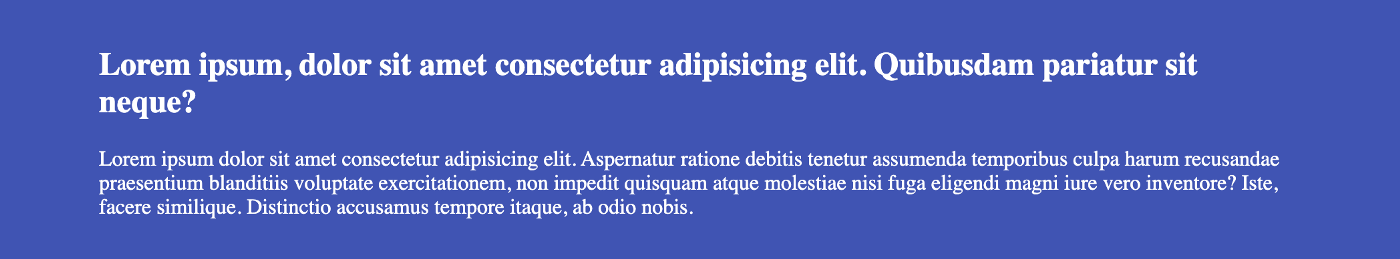
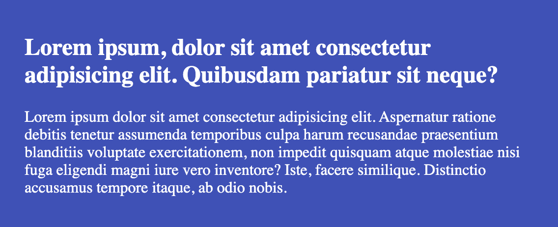
There are probably have been times where you wanted the container to take full width but what is inside the container to only go up to 1200px, for example. What devs normally do is wrap the content inside a wrapper container and set a max-width on it. Something similar to the following markup and CSS.
<main>
  <div class="wrapper">
    <h2>Lorem ipsum, dolor ...</h2>
    <p>Lorem ...</p>
  </div>
</main>
main {
background: #3f51b5;
color: #fff;
width: 100vw;
}
.wrapper {
margin: 0 auto;
padding: 15px 25px;
max-width: 900px;
}A better and less HTML intrusive solution would use CSS padding alone. The formula is something like this: 100vw — min(max-width, (100vw — (left-gap + right-gap))) / 2.
main {
  background: #3f51b5;
  padding: 15px calc((00vw - min(900px, calc(100vw - 50px))) / 2);
  color: #fff;
}
Both solutions would look like this when the browser is beyond and below max-width respectively. This solution requires no additional markup.
6 — Extend the clickable area
Let’s say you have a clickable element that is small and on mobile, it appears too small to become easily clickable. You can increase the clickable area of the element without changing the element to look any differently just by using pseudo-elements. Since they are part of the element, when they get a click the click naturally propagates to the parent. You just have to make them invisible.
The following example simply extends the type circle dot button click area by 2(two) by positioning a pseudo-element on top and centered.
button {
  border: none;
  background: #222;
  width: 10px;
  height: 10px;
  border-radius: 50%;
  padding: 0;
  position: relative;
  cursor: pointer;
}
button::after {
  content: '';
  position: absolute;
  left: 50%;
  top: 50%;
  transform: translate(-50%, -50%);
  width: 200%;
  height: 200%;
  display: inline-block;
  /* for demo purpose only - should be removed */
  background: rgba(0, 0, 0, 0.2);
}
7 — Responsive text
If you ever wanted your font size to adapt with the size of the site — which you should if you ever code frontend — then this simple formula got you covered;
font-size: calc([minimum size] + ([maximum size] - [minimum size]) * ((100vw - [minimum viewport width]) / ([maximum viewport width] - [minimum viewport width])));You can also get a closer result with a much simpler CSS option, clamp function, which has decent support .
font-size: clamp(min, viewport-width-unit, max);8 — Frosted glass effect
Something that has been there forever and got adopted by designers and all at sudden 80% of all designs started including is the frosted glass effect. You simply use the backdrop filter and the color is determined by the background.
.container {
  background-color: rgba(255, 255, 255, 0.15);
  backdrop-filter: blur(5px);
}
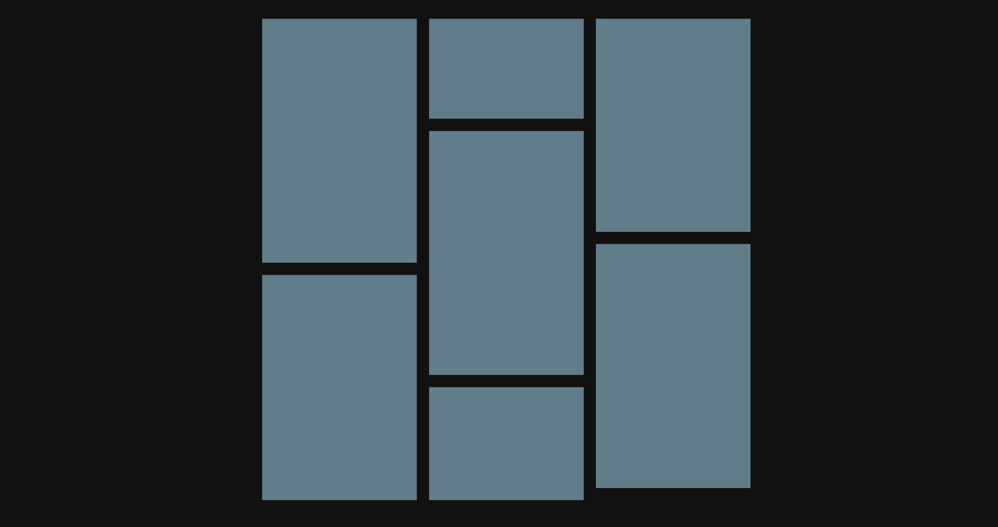
9 — Image grid with random height (Mansory Layout)
This is the famous Pinterest layout that you can use the old column property to accomplish quite easily.
<div class="container">
  <div class="item"></div>
</div>
.container {
width: 600px;
-webkit-column-count: 3;
-moz-column-count: 3;
column-count: 3;
-webkit-column-gap: 15px;
-moz-column-gap: 15px;
column-gap: 15px;
}
.item {
display: block;
/* match gap size */
margin-bottom: 15px;
}
10 — Math with Calc
Nothing in this world requires no math and the CSS calc function is magical. What makes it magical is the fact that you can mix unit types and do extensive calculations to help you position, resize, rotate elements easily. You already saw a good use case with tip #5 and tip #7 but here a few useful bunches you can use.
Position background precisely:
// position 20px from the right and 10px from the bottom
background-position: calc(100% - 20px) calc(100% - 10px);
Flex items (better than flex: 1) — Greate to fit items in the remaining available space.
.header {
  height: 100px;
}
.content {
  height: calc(100% - 100px);
}
Rotate without needing to know the exact angle
transform: rotate(calc(3turn + 45deg));Create your own utility class for column layout:
[data-columns='1'] .col {
  width: calc(100% / 1);
}
[data-columns='2'] .col {
  width: calc(100% / 2);
}
[data-columns='3'] .col {
  width: calc(100% / 3);
}
[data-columns='4'] .col {
  width: calc(100% / 4);
}
[data-columns='5'] .col {
  width: calc(100% / 5);
}
[data-columns='6'] .col {
  width: calc(100% / 6);
}
User variables for more magic:
.foo {
  --widthA: 100px;
  --widthB: calc(var(--widthA) / 2);
  --widthC: calc(var(--widthB) / 2);
  width: var(--widthC);
}
Conclusion
CSS is fun and full of magic and it is always great when you feel like you know something more and the process of discovering CSS tricks is simply a good one. Sometimes it is about exploring the options, reading the specs and sometimes it can appear like it is pure luck, but CSS is growing and the tricks will never end.
See you in part 3! Meanwhile, check my Youtube Channel for more.