- 代码只作演示用途,不会详细说明语法
- 部分技巧示例代码过长,使用 CodePen 进行保存,点击在线演示即可查看
- 兼容项点击链接即可查看当前属性的浏览器兼容数据,自行根据项目兼容需求考虑是否使用
- 以下代码全部基于 CSS 进行书写,没有任何 JS 代码,没有特殊说明的情况下所有属性和方法都是 CSS 类型
- 一部分技巧是自己探讨出来的,另一部分技巧是参考各位前端大神们的,都是一个互相学习的过程,大家一起进步
Layout Skill
使用 vw 定制 rem 自适应布局
解析
- 要点:移动端使用
rem布局需要通过 JS 设置不同屏幕宽高比的font-size,结合vw单位和calc()可脱离 JS 的控制 - 场景:rem 页面布局 (不兼容低版本移动端系统)
- 兼容:vw、calc()
/* 基于UI width=750px DPR=2的页面 */
html {
font-size: calc(100vw / 7.5);
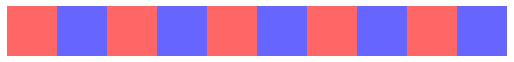
}使用:nth-child() 选择指定元素
解析
- 要点:通过
:nth-child()筛选指定的元素设置样式 - 场景:表格着色、边界元素排版 (首元素、尾元素、左右两边元素)
- 兼容::nth-child()
- 代码:在线演示
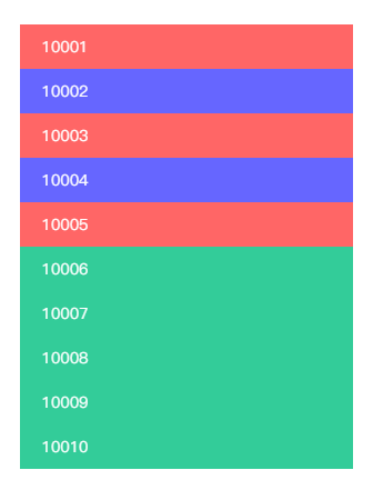
<div class="bruce flex-ct-x" data-title="使用:nth-child()选择指定元素">
  <ul class="specified-scope">
    <li>10001</li>
    <li>10002</li>
    <li>10003</li>
    <li>10004</li>
    <li>10005</li>
    <li>10006</li>
    <li>10007</li>
    <li>10008</li>
    <li>10009</li>
    <li>10010</li>
  </ul>
</div>
.specified-scope {
  width: 300px;
  li {
    padding: 0 20px;
    height: 40px;
    line-height: 40px;
    color: #fff;
    &:nth-child(odd) {
      background-color: #f66;
    }
    &:nth-child(even) {
      background-color: #66f;
    }
    &:nth-child(n+6):nth-child(-n+10) {
      background-color: #3c9;
    }
  }
}
使用 writing-mode 排版竖文
解析
- 要点:通过
writing-mode调整文本排版方向 - 场景:竖行文字、文言文、诗词
- 兼容:writing-mode
- 代码:在线演示
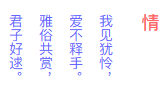
<div class="bruce flex-ct-x" data-title="使用writing-mode排版竖向文本">
  <div class="vertical-text">
    <h3>情</h3>
    <p>我见犹怜,<br>爱不释手.<br>雅俗共赏,<br>君子好逑.</p>
  </div>
</div>
.vertical-text {
  writing-mode: vertical-rl;
  h3 {
    padding-left: 20px;
    font-weight: bold;
    font-size: 18px;
    color: #f66;
  }
  p {
    line-height: 30px;
    color: #66f;
  }
}
使用 text-align-last 对齐两端文本
解析
- 要点:通过
text-align-last:justify设置文本两端对齐 - 场景:未知字数中文对齐
- 兼容:text-align-last
- 代码:在线演示
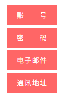
<div class="bruce flex-ct-x" data-title="使用text-align-last对齐两端文本">
  <ul class="justify-text">
    <li>账号</li>
    <li>密码</li>
    <li>电子邮件</li>
    <li>通讯地址</li>
  </ul>
</div>
.justify-text {
  li {
    padding: 0 20px;
    width: 100px;
    height: 40px;
    background-color: #f66;
    line-height: 40px;
    text-align-last: justify;
    color: #fff;
    & + li {
      margin-top: 5px;
    }
  }
}
使用:not() 去除无用属性
解析
%E5%8E%BB%E9%99%A4%E6%97%A0%E7%94%A8%E5%B1%9E%E6%80%A7.png)
<div class="bruce flex-ct-x" data-title="使用:not()去除无用属性">
  <ul class="cleared-attr">
    <li class="first-line">
      <span>A</span>
      <span>B</span>
      <span>C</span>
      <span>D</span>
      <span>E</span>
    </li>
    <li class="second-line">
      <span>A</span>
      <span>B</span>
      <span>C</span>
      <span>D</span>
      <span>E</span>
    </li>
  </ul>
</div>
.cleared-attr {
li {
height: 40px;
line-height: 40px;
}
span {
display: inline-block;
color: #66f;
}
.first-line span:not(:last-child)::after {
content: ",";
}
.second-line span:not(:nth-child(-n+3)) {
display: none;
}
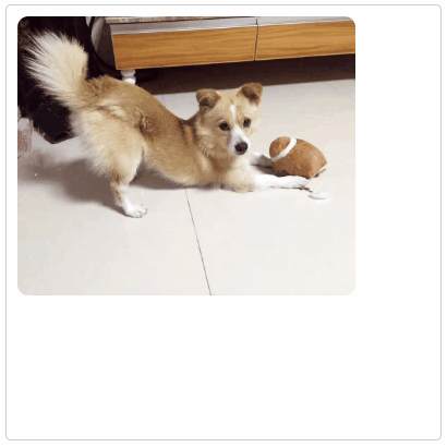
}使用 object-fit 规定图像尺寸
解析
- 要点:通过
object-fit使图像脱离background-size的约束,使用<img>来标记图像背景尺寸 - 场景:图片尺寸自适应
- 兼容:object-fit
- 代码:在线演示
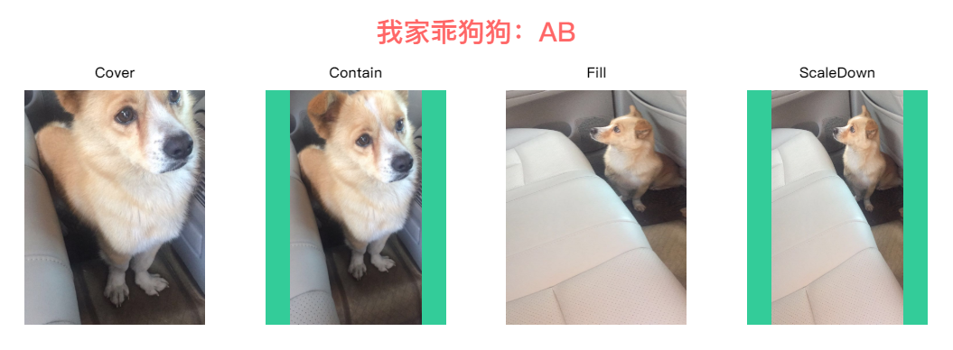
<div class="bruce flex-ct-y" data-title="使用object-fit规定图像尺寸">
  <h1>我家乖狗狗:AB</h1>
  <ul class="image-size">
    <li>
      <h3>Cover</h3>
      <img class="cover" src="https://static.yangzw.vip/codepen/ab-1.jpg">
    </li>
    <li>
      <h3>Contain</h3>
      <img class="contain" src="https://static.yangzw.vip/codepen/ab-1.jpg">
    </li>
    <li>
      <h3>Fill</h3>
      <img class="fill" src="https://static.yangzw.vip/codepen/ab-2.jpg">
    </li>
    <li>
      <h3>ScaleDown</h3>
      <img class="scale-down" src="https://static.yangzw.vip/codepen/ab-2.jpg">
    </li>
  </ul>
</div>
h1 {
line-height: 50px;
font-size: 30px;
color: #f66;
}
.image-size {
display: flex;
justify-content: space-between;
width: 1000px;
height: 300px;
li {
width: 200px;
}
h3 {
height: 40px;
line-height: 40px;
text-align: center;
font-weight: bold;
font-size: 16px;
}
img {
width: 100%;
height: 260px;
background-color: #3c9;
&.cover {
object-fit: cover;
}
&.contain {
object-fit: contain;
}
&.fill {
object-fit: fill;
}
&.scale-down {
object-fit: scale-down;
}
}
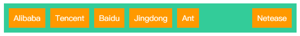
}🔥 使用 overflow-x 排版横向列表
解析
- 要点:通过
flexbox或inline-block的形式横向排列元素,对父元素设置overflow-x:auto横向滚动查看 - 场景:横向滚动列表、元素过多但位置有限的导航栏
- 兼容:overflow-x
- 代码:在线演示
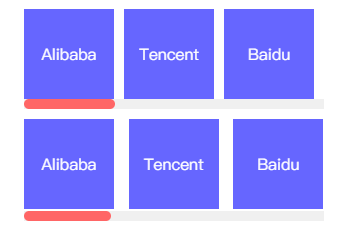
<div class="bruce flex-ct-y" data-title="使用overflow-x排版横向列表">
  <div class="horizontal-list flex">
    <ul>
      <li>Alibaba</li>
      <li>Tencent</li>
      <li>Baidu</li>
      <li>Jingdong</li>
      <li>Ant</li>
      <li>Netease</li>
      <li>Meituan</li>
      <li>ByteDance</li>
      <li>360</li>
      <li>Sina</li>
    </ul>
  </div>
  <div class="horizontal-list inline">
    <ul>
      <li>Alibaba</li>
      <li>Tencent</li>
      <li>Baidu</li>
      <li>Jingdong</li>
      <li>Ant</li>
      <li>Netease</li>
      <li>Meituan</li>
      <li>ByteDance</li>
      <li>360</li>
      <li>Sina</li>
    </ul>
  </div>
</div>
.horizontal-list {
  overflow: hidden;
  width: 300px;
  height: 100px;
  & + .horizontal-list {
    margin-top: 10px;
  }
  ul {
    overflow-x: scroll;
    cursor: pointer;
    &::-webkit-scrollbar {
      height: 10px;
    }
    &::-webkit-scrollbar-track {
      background-color: #f0f0f0;
    }
    &::-webkit-scrollbar-thumb {
      border-radius: 5px;
      background-color: #f66;
    }
  }
  li {
    overflow: hidden;
    margin-left: 10px;
    height: 90px;
    background-color: #66f;
    line-height: 90px;
    text-align: center;
    font-size: 16px;
    color: #fff;
    &:first-child {
      margin-left: 0;
    }
  }
  &.flex {
    ul {
      display: flex;
      flex-wrap: nowrap;
      justify-content: space-between;
    }
    li {
      flex-shrink: 0;
      flex-basis: 90px;
    }
  }
  &.inline {
    height: 102px;
    ul {
      overflow-y: hidden;
      white-space: nowrap;
    }
    li {
      display: inline-block;
      width: 90px;
    }
  }
}
列表 <ul> <dl> 等默认是纵向排列,但有时列表需要横向排列。
<li>标签的使用 float 属性 横向排列
在网页中,很多地方都会用到无序列表横向排列的形式,通常的写法都是使得 li 的 css 样式设置为float:left 的形式即可,li 会依次从最左边开始并列对齐,
<ul>
  <li>Alibaba</li>
  <li>Tencent</li>
</ul>
li {
  display: block;
  float: left;
}<li>标签的 display:inline 样式 横向排列
<ul>
  <li>Alibaba</li>
  <li>Tencent</li>
</ul>
li {
  display: inline;
}
使用 text-overflow 控制文本溢出
解析
- 要点:通过
text-overflow:ellipsis对溢出的文本在末端添加... - 场景:单行文字溢出、多行文字溢出
- 兼容:text-overflow、line-clamp、box-orient
- 代码:在线演示
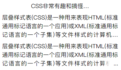
<div class="bruce flex-ct-y" data-title="使用text-overflow控制文本溢出">
  <p class="ellipsis-text s-line sl-ellipsis">CSS非常有趣和搞怪,可以做一些JS也能做的事情</p>
  <p class="ellipsis-text m-line ml-ellipsis">层叠样式表(CSS)是一种用来表现HTML(标准通用标记语言的一个应用)或XML(标准通用标记语言的一个子集)等文件样式的计算机语言.CSS不仅可以静态地修饰网页,还可以配合各种脚本语言动态地对网页各元素进行格式化.</p>
  <p class="ellipsis-text m-line mls-ellipsis">层叠样式表(CSS)是一种用来表现HTML(标准通用标记语言的一个应用)或XML(标准通用标记语言的一个子集)等文件样式的计算机语言.CSS不仅可以静态地修饰网页,还可以配合各种脚本语言动态地对网页各元素进行格式化.</p>
</div>
.ellipsis-text {
  line-height: 30px;
  font-size: 20px;
  &.s-line {
    width: 200px;
  }
  &.m-line {
    margin-top: 10px;
    width: 400px;
    text-align: justify;
  }
  &.sl-ellipsis {
    overflow: hidden;
    text-overflow: ellipsis;
    white-space: nowrap;
  }
  &.ml-ellipsis {
    display: -webkit-box;
    overflow: hidden;
    text-overflow: ellipsis;
    -webkit-box-orient: vertical;
    -webkit-line-clamp: 3;
  }
  &.mls-ellipsis {
    overflow: hidden;
    position: relative;
    max-height: 90px;
    &::after {
      position: absolute;
      right: 0;
      bottom: 0;
      padding-left: 40px;
      background: linear-gradient(to right, transparent, #fff 50%);
      content: "...";
    }
  }
}
使用 transform 描绘 1px 边框
解析
- 要点:分辨率比较低的屏幕下显示 1px 的边框会显得模糊,通过
::before或::after和transform模拟细腻的 1px 边框 - 场景:容器 1px 边框
- 兼容:transform
- 代码:在线演示
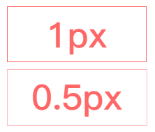
<div class="bruce flex-ct-y" data-title="使用transform描绘像素边框">
  <div class="onepx-border normal">1px</div>
  <div class="onepx-border thin">0.5px</div>
</div>
.onepx-border {
  width: 200px;
  height: 80px;
  cursor: pointer;
  line-height: 80px;
  text-align: center;
  font-weight: bold;
  font-size: 50px;
  color: #f66;
  & + .onepx-border {
    margin-top: 10px;
  }
  &.normal {
    border: 1px solid #f66;
  }
  &.thin {
    position: relative;
    &::after {
      position: absolute;
      left: 0;
      top: 0;
      border: 1px solid #f66;
      width: 200%;
      height: 200%;
      content: "";
      transform: scale(.5);
      transform-origin: left top;
    }
  }
}
使用 transform 翻转内容
解析
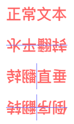
<div class="bruce flex-ct-x" data-title="使用transform翻转内容">
  <ul class="flip-content">
    <li>正常文本</li>
    <li class="x-axis">水平翻转</li>
    <li class="y-axis">垂直翻转</li>
    <li class="reverse">倒序翻转</li>
  </ul>
</div>
.flip-content {
  li {
    position: relative;
    width: 121px;
    height: 51px;
    line-height: 51px;
    text-align: center;
    font-weight: bold;
    font-size: 30px;
    color: #f66;
    &::before,
    &::after {
      position: absolute;
      background-color: #66f;
      content: "";
    }
    & + li {
      margin-top: 10px;
    }
    &.x-axis {
      transform: scale3d(1, -1, 1);
      &::after {
        left: 0;
        top: 25px;
        width: 100%;
        height: 1px;
      }
    }
    &.y-axis {
      transform: scale3d(-1, 1, 1);
      &::after {
        left: 60px;
        top: 0;
        width: 1px;
        height: 100%;
      }
    }
    &.reverse {
      transform: scale3d(-1, -1, 1);
      &::before {
        left: 0;
        top: 25px;
        width: 100%;
        height: 1px;
      }
      &::after {
        left: 60px;
        top: 0;
        width: 1px;
        height: 100%;
      }
    }
  }
}
使用 letter-spacing 排版倒序文本
解析
- 要点:通过
letter-spacing设置负值字体间距将文本倒序 - 场景:文言文、诗词
- 兼容:letter-spacing
- 代码:在线演示
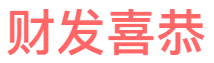
<div class="bruce flex-ct-x" data-title="使用letter-spacing排版倒序文本">
  <div class="reverse-text">恭喜发财</div>
</div>
.reverse-text {
  padding-left: 100px; // 与letter-spacing一致
  font-weight: bold;
  font-size: 50px;
  color: #f66;
  letter-spacing: -100px; // letter-spacing最少是font-size的2倍
}
使用 margin-left 排版左重右轻列表
解析
<div class="bruce flex-ct-y" data-title="使用margin排版凸显布局">
  <ul class="highlight-list left">
    <li>Alibaba</li>
    <li>Tencent</li>
    <li>Baidu</li>
    <li>Jingdong</li>
    <li>Ant</li>
    <li>Netease</li>
  </ul>
  <ul class="highlight-list right">
    <li>Alibaba</li>
    <li>Tencent</li>
    <li>Baidu</li>
    <li>Jingdong</li>
    <li>Ant</li>
    <li>Netease</li>
  </ul>
</div>
.highlight-list {
  display: flex;
  align-items: center;
  padding: 0 10px;
  width: 600px;
  height: 60px;
  background-color: #3c9;
  & + .highlight-list {
    margin-top: 10px;
  }
  li {
    padding: 0 10px;
    height: 40px;
    background-color: #f90;
    line-height: 40px;
    font-size: 16px;
    color: #fff;
  }
  &.left li {
    & + li {
      margin-left: 10px;
    }
    &:last-child {
      margin-left: auto;
    }
  }
  &.right li {
    & + li {
      margin-left: 10px;
    }
    &:first-child {
      margin-right: auto;
    }
  }
}
Behavior Skill
使用 overflow-scrolling 支持弹性滚动
解析
- 要点:iOS 页面
非body元素的滚动操作会非常卡 (Android 不会出现此情况),通过overflow-scrolling:touch调用 Safari 原生滚动来支持弹性滚动,增加页面滚动的流畅度 - 场景:iOS 页面滚动
- 兼容:iOS 自带
-webkit-overflow-scrolling
body {
  -webkit-overflow-scrolling: touch;
}
.elem {
  overflow: auto;
}
使用 transform 启动 GPU 硬件加速
解析
- 要点:有时执行动画可能会导致页面卡顿,可在特定元素中使用硬件加速来避免这个问题
- 场景:动画元素 (绝对定位、同级中超过 6 个以上使用动画)
- 兼容:transform
.elem {
  transform: translate3d(0, 0, 0); /* translateZ(0)亦可 */
}
使用 attr() 抓取 data-*
解析
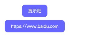
<div class="bruce flex-ct-y" data-title="使用attr()抓取用户属性">
  <a class="hover-tips" href="https://www.baidu.com" data-msg="Hello World">提示框</a>
  <a class="hover-tips" href="https://www.baidu.com"></a>
</div>
.hover-tips {
position: relative;
padding: 0 20px;
border-radius: 10px;
height: 40px;
background-color: #66f;
line-height: 40px;
color: #fff;
&::after {
position: absolute;
left: 0;
top: 0;
border-radius: 5px;
width: 100%;
height: 100%;
background-color: rgba(#000, .5);
opacity: 0;
text-align: center;
font-size: 12px;
content: attr(data-msg);
transition: all 300ms;
}
&:hover::after {
left: calc(100% + 20px);
opacity: 1;
}
&[href]:empty::before {
content: attr(href);
}
&[href]:empty:hover::after {
display: none;
}
& + .hover-tips {
margin-top: 10px;
}
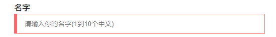
}使用:valid 和:invalid 校验表单
解析
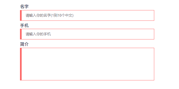
<div class="bruce flex-ct-x" data-title="使用:valid和:invalid校验输入表单
">
  <form class="form-validation">
    <div>
      <label>名字</label>
      <input type="text" placeholder="请输入你的名字(1到10个中文)" pattern="^[\u4e00-\u9fa5]{1,10}$" required>
    </div>
    <div>
      <label>手机</label>
      <input type="text" placeholder="请输入你的手机" pattern="^1[3456789]\d{9}$" required>
    </div>
    <div>
      <label>简介</label>
      <textarea required></textarea>
    </div>
  </form>
</div>
.form-validation {
  width: 500px;
  div + div {
    margin-top: 10px;
  }
  label {
    display: block;
    padding-bottom: 5px;
    font-weight: bold;
    font-size: 16px;
  }
  input,
  textarea {
    display: block;
    padding: 0 20px;
    border: 1px solid #ccc;
    width: 100%;
    height: 40px;
    outline: none;
    caret-color: #09f;
    transition: all 300ms;
    &:valid {
      border-color: #3c9;
    }
    &:invalid {
      border-color: #f66;
    }
  }
  textarea {
    height: 122px;
    resize: none;
    line-height: 30px;
    font-size: 16px;
  }
}
使用 pointer-events 禁用事件触发
解析
- 要点:通过
pointer-events:none禁用事件触发 (默认事件、冒泡事件、鼠标事件、键盘事件等),相当于<button>的disabled - 场景:限时点击按钮 (发送验证码倒计时)、事件冒泡禁用 (多个元素重叠且自带事件、a 标签跳转)
- 兼容:pointer-events
- 代码:在线演示

<div class="bruce flex-ct-x" data-title="使用pointer-events禁用事件触发">
  <a class="disabled-trigger" href="https://www.baidu.com">点我</a>
</div>
.disabled-trigger {
  padding: 0 20px;
  border-radius: 10px;
  height: 40px;
  background-color: #66f;
  pointer-events: none;
  line-height: 40px;
  color: #fff;
}
document.getElementsByClassName("disabled-trigger")[0].addEventListener("click", () => alert("Hello World"));使用 + 或~ 美化选项框
解析
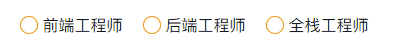
<div class="bruce flex-ct-x" data-title="使用+或~美化选项表单">
  <ul class="beauty-selection">
    <li>
      <input id="fed-engineer" type="radio" name="radioName" hidden>
      <label for="fed-engineer"></label>
      <span>前端工程师</span>
    </li>
    <li>
      <input id="bed-engineer" type="radio" name="radioName" hidden>
      <label for="bed-engineer"></label>
      <span>后端工程师</span>
    </li>
    <li>
      <input id="fsd-engineer" type="radio" name="radioName" hidden>
      <label for="fsd-engineer"></label>
      <span>全栈工程师</span>
    </li>
  </ul>
</div>
.beauty-selection {
  display: flex;
  li {
    display: flex;
    align-items: center;
    & + li {
      margin-left: 20px;
    }
  }
  input:checked + label {
    background-color: #f90;
  }
  label {
    margin-right: 5px;
    padding: 2px;
    border: 1px solid #f90;
    border-radius: 100%;
    width: 18px;
    height: 18px;
    background-clip: content-box;
    cursor: pointer;
    transition: all 300ms;
    &:hover {
      border-color: #09f;
      background-color: #09f;
      box-shadow: 0 0 7px #09f;
    }
  }
  span {
    font-size: 16px;
  }
}
使用:focus-within 分发冒泡响应
解析
- 要点:表单控件触发
focus和blur事件后往父元素进行冒泡,在父元素上通过:focus-within捕获该冒泡事件来设置样式 - 场景:登录注册弹框、表单校验、离屏导航、导航切换
- 兼容::focus-within、:placeholder-shown
- 代码:在线演示
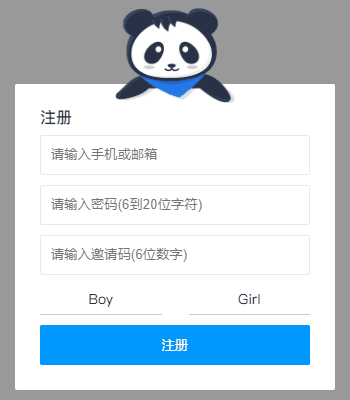
<div class="bruce flex-ct-x" data-title="使用:focus-within分发冒泡响应">
  <form class="bubble-distribution">
    <h3>注册</h3>
    <div class="accout">
      <input type="text" placeholder="请输入手机或邮箱" pattern="^1[3456789]\d{9}$|^[\w-]+(\.[\w-]+)*@[\w-]+(\.[\w-]+)+$" required>
      <img src="https://b-gold-cdn.xitu.io/v3/static/img/greeting.1415c1c.png">
    </div>
    <div class="password">
      <input type="password" placeholder="请输入密码(6到20位字符)" pattern="^[\dA-Za-z_]{6,20}$" required>
      <img src="https://b-gold-cdn.xitu.io/v3/static/img/blindfold.58ce423.png">
    </div>
    <div class="code">
      <input type="text" placeholder="请输入邀请码(6位数字)" pattern="^[\d]{6}$" maxLength="6" required>
      <button type="button">查询</button>
      <img src="https://b-gold-cdn.xitu.io/v3/static/img/greeting.1415c1c.png">
    </div>
    <img src="https://b-gold-cdn.xitu.io/v3/static/img/normal.0447fe9.png">
    <ul>
      <li>
        <input id="male" type="radio" name="sex">
        <label for="male">Boy</label>
      </li>
      <li>
        <input id="female" type="radio" name="sex">
        <label for="female">Girl</label>
      </li>
    </ul>
    <button type="button">注册</button>
  </form>
</div>
.bruce {
  background-color: #999;
}
.bubble-distribution {
  position: relative;
  margin-top: 50px;
  padding: 25px;
  border-radius: 2px;
  width: 320px;
  background-color: #fff;
  h3 {
    font-size: 16px;
    color: #333;
  }
  div {
    margin-top: 10px;
  }
  img {
    position: absolute;
    left: 50%;
    bottom: 100%;
    margin: 0 0 -20px -60px;
    width: 120px;
  }
  ul {
    display: flex;
    justify-content: space-between;
    align-items: center;
    margin-top: 10px;
    height: 30px;
    line-height: 30px;
  }
  li {
    position: relative;
    width: 45%;
    transition: all 300ms;
    &:focus-within {
      background: linear-gradient(90deg, #09f 50%, transparent 0) repeat-x,
        linear-gradient(90deg, #09f 50%, transparent 0) repeat-x,
        linear-gradient(0deg, #09f 50%, transparent 0) repeat-y,
        linear-gradient(0deg, #09f 50%, transparent 0) repeat-y;
      background-position: 0 0, 0 100%, 0 0, 100% 0;
      background-size: 8px 1px, 8px 1px, 1px 8px, 1px 8px;
      animation: move 500ms infinite linear;
    }
  }
  input[type=text],
  input[type=password] {
    padding: 10px;
    border: 1px solid #e9e9e9;
    border-radius: 2px;
    width: 100%;
    height: 40px;
    outline: none;
    transition: all 300ms;
    &:focus:valid {
      border-color: #09f;
    }
    &:focus:invalid {
      border-color: #f66;
    }
  }
  input[type=radio] {
    position: absolute;
    width: 0;
    height: 0;
    &:checked + label {
      border: 3px solid transparent;
      background-color: #09f;
      color: #fff;
    }
  }
  label {
    display: block;
    border-bottom: 1px solid #ccc;
    width: 100%;
    background-clip: padding-box;
    cursor: pointer;
    text-align: center;
    transition: all 300ms;
  }
  button {
    overflow: hidden;
    margin-top: 10px;
    border: none;
    border-radius: 2px;
    width: 100%;
    height: 40px;
    outline: none;
    background-color: #09f;
    cursor: pointer;
    color: #fff;
    transition: all 300ms;
  }
  .accout,
  .password,
  .code {
    img {
      display: none;
      margin-bottom: -27px;
    }
    &:focus-within {
      img {
        display: block;
      }
      & ~ img {
        display: none;
      }
    }
  }
  .code {
    display: flex;
    justify-content: space-between;
    button {
      margin-top: 0;
    }
    input {
      &:not(:placeholder-shown) {
        width: 70%;
        & + button {
          width: 25%;
        }
      }
      &:placeholder-shown {
        width: 100%;
        & + button {
          width: 0;
          opacity: 0;
        }
      }
    }
  }
}
@keyframes move {
  to {
    background-position: 6% 0, -6% 100%, 0 -6%, 100% 6%;
  }
}
使用:hover 描绘鼠标跟随
解析

.bruce(data-title="使用:hover描绘鼠标跟随")
  ul.mouse-following
    - for (let i = 0; i < 500; i++)
      li
@function random-num($max, $min: 0, $u: 1) {
  @return ($min + random($max)) * $u;
}
.mouse-following {
  display: flex;
  overflow: hidden;
  flex-wrap: wrap;
  height: 100%;
  cursor: pointer;
  li {
    position: relative;
    width: 30px;
    height: 30px;
    &::before {
      position: absolute;
      left: 0;
      right: 0;
      top: 0;
      bottom: 0;
      border-radius: 100%;
      background-color: transparent;
      content: "";
      transform: scale3d(.1, .1, 1);
      transition: all 500ms ease-in;
    }
    &:hover {
      &::before {
        transform: scale3d(1.8, 1.8, 1.8);
        transition: transform 0s;
      }
    }
    @for $i from 1 through 500 {
      &:nth-child(#{$i}):hover {
        &::before {
          background-color: rgba(random-num(255), random-num(255), random-num(255), .8);
        }
      }
    }
  }
}
使用 max-height 切换自动高度
解析
- 要点:通过
max-height定义收起的最小高度和展开的最大高度,设置两者间的过渡切换 - 场景:隐藏式子导航栏、悬浮式折叠面板
- 兼容:max-height
- 代码:在线演示
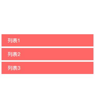
<div class="bruce flex-ct-x" data-title="使用max-height切换自动高度">
  <ul class="auto-height">
    <li>
      <h3>列表1</h3>
      <p>内容1<br>内容2<br>内容3<br>内容4</p>
    </li>
    <li>
      <h3>列表2</h3>
      <p>内容1<br>内容2<br>内容3<br>内容4</p>
    </li>
    <li>
      <h3>列表3</h3>
      <p>内容1<br>内容2<br>内容3<br>内容4</p>
    </li>
  </ul>
</div>
.auto-height {
  width: 300px;
  li {
    cursor: pointer;
    & + li {
      margin-top: 5px;
    }
    &:hover p {
      border-bottom-width: 1px;
      max-height: 600px;
    }
  }
  h3 {
    padding: 0 20px;
    height: 40px;
    background-color: #f66;
    cursor: pointer;
    line-height: 40px;
    font-size: 16px;
    color: #fff;
  }
  p {
    overflow: hidden;
    padding: 0 20px;
    border: 1px solid #f66;
    border-top: none;
    border-bottom-width: 0;
    max-height: 0;
    line-height: 30px;
    transition: all 500ms;
  }
}
使用 transform 模拟视差滚动
解析
- 要点:通过
background-attachment:fixed或transform让多层背景以不同的速度移动,形成立体的运动效果 - 场景:页面滚动、视差滚动文字阴影、视差滚动文字虚影
- 兼容:background-attachment、transform
- 代码:在线演示
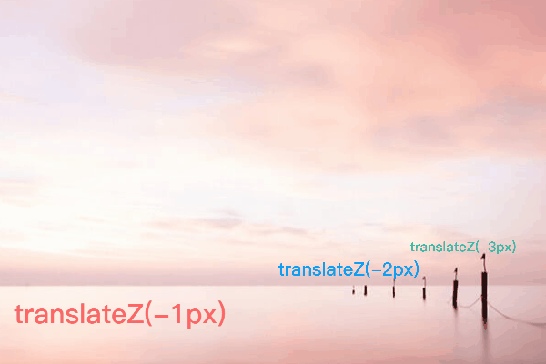
<div class="bruce" data-title="使用transform模拟视差滚动">
  <ul class="parallax-scrolling">
    <li>translateZ(-1px)</li>
    <li>translateZ(-2px)</li>
    <li>translateZ(-3px)</li>
  </ul>
  <p>内容</p>
  <ul class="parallax-scrolling">
    <li>translateZ(-1px)</li>
    <li>translateZ(-2px)</li>
    <li>translateZ(-3px)</li>
  </ul>
</div>
$bg: "https://static.yangzw.vip/codepen/bg.jpg";
.bruce {
  overflow-x: hidden;
  overflow-y: auto;
  perspective: 1px;
  transform-style: preserve-3d;
  p {
    height: 300px;
    line-height: 300px;
    text-align: center;
    font-size: 20px;
    color: #f66;
  }
}
.parallax-scrolling {
  display: flex;
  justify-content: center;
  align-items: center;
  height: 1000px;
  background: url($bg) no-repeat center fixed;
  li {
    width: 500px;
    text-align: center;
    font-weight: bold;
    font-size: 60px;
    &:nth-child(1) {
      color: #f66;
      transform: translateZ(-1px);
    }
    &:nth-child(2) {
      color: #09f;
      transform: translateZ(-2px);
    }
    &:nth-child(3) {
      color: #3c9;
      transform: translateZ(-3px);
    }
  }
}
使用 animation-delay 保留动画起始帧
解析
- 要点:通过
transform-delay或animation-delay设置负值时延保留动画起始帧,让动画进入页面不用等待即可运行 - 场景:开场动画
- 兼容:transform、animation
- 代码:在线演示
<div class="bruce flex-ct-x" data-title="使用animation-delay保留动画首帧">
  <ul class="initial-keyframe">
    <li></li>
    <li></li>
    <li></li>
  </ul>
</div>
.initial-keyframe {
  position: relative;
  width: 100px;
  height: 100px;
  li {
    position: absolute;
    border-radius: 100%;
    width: 100%;
    height: 100%;
    background-color: #3c9;
    transform: rotate(0) translate(-80px, 0);
    animation: rotate 3s linear infinite;
    &:nth-child(2) {
      animation-delay: -1s;
    }
    &:nth-child(3) {
      animation-delay: -2s;
    }
  }
}
@keyframes rotate {
  to {
    transform: rotate(1turn) translate(-80px, 0);
  }
}
使用 resize 拉伸分栏
解析
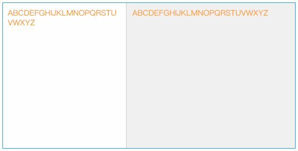
<div class="bruce flex-ct-x" data-title="使用resize拉伸多列分栏">
  <div class="stretching-column">
    <div class="left">
      <div class="resize-bar"></div>
      <div class="resize-line"></div>
      <div class="resize-text">ABCDEFGHIJKLMNOPQRSTUVWXYZ</div>
    </div>
    <div class="right">ABCDEFGHIJKLMNOPQRSTUVWXYZ</div>
  </div>
</div>
.stretching-column {
  overflow: hidden;
  border: 1px solid #09f;
  width: 600px;
  height: 300px;
  line-height: 20px;
  font-size: 16px;
  color: #f90;
  .left {
    overflow: hidden;
    float: left;
    position: relative;
    height: 100%;
  }
  .right {
    overflow: hidden;
    padding: 10px;
    height: 100%;
    background-color: #f0f0f0;
    word-break: break-all;
  }
  .resize-bar {
    overflow: scroll;
    width: 200px;
    height: 100%;
    opacity: 0;
    resize: horizontal;
    &::-webkit-scrollbar {
      width: 200px;
      height: 100%;
    }
    &:hover,
    &:active {
      & ~ .resize-line {
        border-left: 1px dashed #09f;
      }
    }
  }
  .resize-line {
    position: absolute;
    right: 0;
    top: 0;
    bottom: 0;
    border-left: 1px solid #ccc;
    border-right: 2px solid #f0f0f0;
    pointer-events: none;
  }
  .resize-text {
    overflow-x: hidden;
    position: absolute;
    left: 0;
    right: 5px;
    top: 0;
    bottom: 0;
    padding: 10px;
    word-break: break-all;
  }
}
Color Skill
使用 color 改变边框颜色
解析
- 要点:
border没有定义border-color时,设置color后,border-color会被定义成color - 场景:边框颜色与文字颜色相同
- 兼容:color
.elem {
  border: 1px solid;
  color: #f66;
}
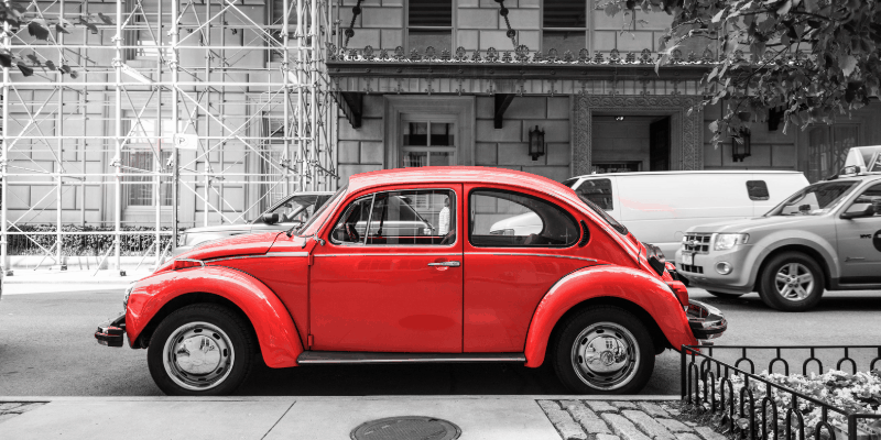
使用 filter 开启悼念模式
解析
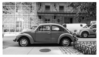
<div class="bruce flex-ct-x" data-title="使用filter开启悼念模式">
  <img class="mourning-mode" src="https://static.yangzw.vip/codepen/car.jpg">
</div>
.mourning-mode {
  width: 400px;
  filter: grayscale(100%);
}
使用::selection 改变文本选择颜色
解析
- 要点:通过
::selection根据主题颜色自定义文本选择颜色 - 场景:主题化
- 兼容:::selection
- 代码:在线演示
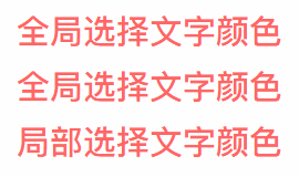
<div class="bruce flex-ct-x" data-title="使用::selection改变选中颜色">
  <div class="select-color">
    <p>全局选择文字颜色</p>
    <p>全局选择文字颜色</p>
    <p class="special">局部选择文字颜色</p>
  </div>
</div>
::selection {
  background-color: #66f;
  color: #fff;
}
.select-color {
  line-height: 50px;
  font-weight: bold;
  font-size: 30px;
  color: #f66;
  p.special::selection {
    background-color: #3c9;
  }
}
使用 linear-gradient 控制背景渐变
解析

<div class="bruce" data-title="使用linear-gradient控制背景渐变">
  <div class="gradient-bg">iCSS</div>
</div>
.gradient-bg {
  display: flex;
  justify-content: center;
  align-items: center;
  height: 100%;
  background: linear-gradient(135deg, #f66, #f90, #3c9, #09f, #66f) left center/400% 400%;
  font-weight: bold;
  font-size: 100px;
  color: #fff;
  animation: move 10s infinite;
}
@keyframes move {
  0%,
  100% {
    background-position-x: left;
  }
  50% {
    background-position-x: right;
  }
}
使用 linear-gradient 控制文本渐变
解析
- 要点:通过
linear-gradient设置背景渐变色,配合background-clip:text对背景进行文本裁剪,添加滤镜动画 - 场景:主题化、特色标题
- 兼容:gradient、background-clip、filter、animation、
text-fill-color - 代码:在线演示
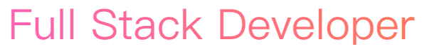
<div class="bruce flex-ct-x" data-title="使用linear-gradient控制文本渐变">
  <h1 class="gradient-text">Full Stack Developer</h1>
</div>
.gradient-text {
  background-image: linear-gradient(90deg, #f66, #f90);
  background-clip: text; // for Edge  Firefox
  -webkit-background-clip: text; // for Chrome Opera Safari
  line-height: 60px;
  font-size: 60px;
  animation: hue 5s linear infinite;
  // -webkit-text-fill-color: transparent;
  color: transparent;
}
@keyframes hue {
  from {
    filter: hue-rotate(0);
  }
  to {
    filter: hue-rotate(-1turn);
  }
}
使用 caret-color 改变光标颜色
解析
- 要点:通过
caret-color根据主题颜色自定义光标颜色 - 场景:主题化
- 兼容:caret-color
- 代码:在线演示
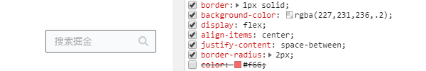
<div class="bruce flex-ct-x" data-title="使用:valid和:invalid校验输入表单
">
  <form class="form-validation">
    <div>
      <label>名字</label>
      <input type="text" placeholder="请输入你的名字(1到10个中文)" pattern="^[\u4e00-\u9fa5]{1,10}$" required>
    </div>
    <div>
      <label>手机</label>
      <input type="text" placeholder="请输入你的手机" pattern="^1[3456789]\d{9}$" required>
    </div>
    <div>
      <label>简介</label>
      <textarea required></textarea>
    </div>
  </form>
</div>
.form-validation {
  width: 500px;
  div + div {
    margin-top: 10px;
  }
  label {
    display: block;
    padding-bottom: 5px;
    font-weight: bold;
    font-size: 16px;
  }
  input,
  textarea {
    display: block;
    padding: 0 20px;
    border: 1px solid #ccc;
    width: 100%;
    height: 40px;
    outline: none;
    caret-color: #09f;
    transition: all 300ms;
    &:valid {
      border-color: #3c9;
    }
    &:invalid {
      border-color: #f66;
    }
  }
  textarea {
    height: 122px;
    resize: none;
    line-height: 30px;
    font-size: 16px;
  }
}
使用::scrollbar 改变滚动条样式
解析
- 要点:通过
scrollbar的scrollbar-track和scrollbar-thumb等属性来自定义滚动条样式 - 场景:主题化、页面滚动
- 兼容:::scrollbar
- 代码:在线演示
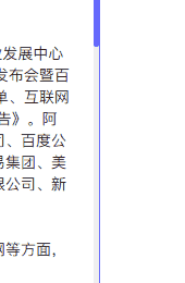
<div class="bruce flex-ct-x" data-title="滚动指示器">
  <div class="scroll-indicator">
    <div>
      <article>
        <h1>2019中国互联网企业100强榜单</h1>
        <p>8月14日,中国互联网协会、工业和信息化部网络安全产业发展中心(工业和信息化部信息中心)在2019年中国互联网企业100强发布会暨百强企业高峰论坛上联合发布了2019年中国互联网企业100强榜单、互联网成长型企业20强榜单和《2019年中国互联网企业100强发展报告》.阿里巴巴(中国)有限公司、深圳市腾讯计算机系统有限责任公司、百度公司、京东集团、浙江蚂蚁小微金融服务集团股份有限公司、网易集团、美团点评、北京字节跳动科技有限公司、三六零安全科技股份有限公司、新浪公司位列榜单前十名.</p>
        <p>今年互联网百强企业聚焦创新引领、产业融合、工业互联网等方面,主要呈现出六大特点:</p>
        <p>一是整体规模跨越式提升,成为数字经济新引擎.2019年互联网百强企业互联网业务收入高达2.75万亿元,比2018年互联网百强企业互联网业务收入增长超过1万亿元,占我国数字经济的比重达8.8%,对数字经济的贡献率达14%,带动数字经济增长近2个百分点成为带动我国互联网产业发展的重要支撑.从互联网业务收入增长率分布看,有86家企业互联网业务收入实现增长.</p>
        <p>二是研发投入强度突破10%,打造中国核心技术.2019年互联网百强企业的研发投入达到1538.7亿元,同比增长45.1%,平均研发强度突破10%,比我国R&D经费投入强度高出近8个百分点.从研发强度分布看,有40家企业研发强度在10%以上,4家企业研发强度在30%-35%之间.互联网百强企业不断突破核心技术,互联网百强企业不断提升原始创新能力,加快推进5G、人工智能、云计算、大数据等关键核心技术突破,部分技术处于国际领先水平.2019年互联网百强企业已经拥有专利近8万项,其中发明专利数近6万项.2019年互联网百强企业中应用大数据企业29家,云计算28家,人工智能相关企业24家,运用物联网技术相关的企业3家.</p>
        <p>三是应用场景多元化,智能+打造生活消费新模式.互联网百强企业深化消费互联网发展,已对衣、食、住、行等各方面进行了全场景覆盖,业务涵盖互联网公共服务、网络媒体、音乐与视频、社交网络、科技创新与知识产权等17个领域,全方位提升了人民群众的生活、工作、文化、娱乐、教育等方面的生活质量.2019年互联网百强企业中从事电子商务的共18家;涉及互联网公共服务的共41家,主要提供信息查询、教育医疗、政务办理、公共出行等便民服务,让普通人民享受到"互联网+"带来的便利生活;21家企业涉及音乐与视频业务.同时,互联网百强企业积极发展智能产业,不断拓展"智能+",创造了智慧门店、VR/AR试衣试妆、无感支付等丰富的新消费业态和场景,打造未来智能生活消费新模式.</p>
        <p>四是工业互联网入实践深耕,赋能传统产业高质量发展.互联网百强企业通过不断向各行各业"渗透"和"赋能",推动云计算、大数据、物联网等信息通信技术与实体经济深入融合,培育新产业、新业态、新模式,支撑实体经济高质量发展.2019年互联网百强企业产业互联网数量再创新高,以服务实体经济客户为主的产业互联网领域企业数量达到60家,累计服务近4000万家企业.其中,涉及互联网数据服务41家,生产制造服务13家,科技创新和知识产权24家,B2B电商11家,互联网基础服务10家.</p>
        <p>五是"独角兽" 企业快速增长,国际行业地位再创新高.2019年互联网百强企业及下属企业涌现出蚂蚁金服、字节跳动、京东数科、满帮集团、优刻得、找钢网等25家独角兽企业,同比增长38.9%,业务涉及金融科技、智慧物流、电子商务、新文娱等领域.从全球公司市值排名情况看,2018年,全球互联网公司市值前三十强中互联网百强企业占10家,其中,腾讯集团和阿里巴巴稳居全球互联网公司市值前十强.</p>
        <p>六是覆盖地域实现新扩展,网络扶贫取得新成效.2019年拥有互联网百强企业的省份达到18个,在2018年基础上新增江西和山东两个省份,地域覆盖不断增加.在区域分布上,东部地区互联网百强企业数量共86家,中西部地区互联网百强企业共12家,东北地区互联网百强企业数量保持2家.其中,安徽、贵州、河南、湖北、湖南、江西、重庆、四川8个中西部地区互联网百强企业数量不断增加,较去年增长1家.互联网百强企业积极践行企业社会责任,发挥互联网在助推脱贫攻坚中的作用,探索"直播+电商"等扶贫新模式,推进精准扶贫、精准脱贫.据统计,超过一半以上互联网百强企业参与网络扶贫.</p>
      </article>
    </div>
  </div>
</div>
.scroll-indicator {
  overflow: hidden;
  position: relative;
  border: 1px solid #66f;
  width: 500px;
  height: 300px;
  &::after {
    position: absolute;
    left: 0;
    right: 5px;
    top: 2px;
    bottom: 0;
    background-color: #fff;
    content: "";
  }
  div {
    overflow: auto;
    height: 100%;
    &::-webkit-scrollbar {
      width: 5px;
    }
    &::-webkit-scrollbar-track {
      background-color: #f0f0f0;
    }
    &::-webkit-scrollbar-thumb {
      border-radius: 2px;
      background-color: #66f;
    }
  }
  article {
    padding: 0 20px;
    background: linear-gradient(to right top, #f66 50%, #f0f0f0 50%) no-repeat;
    background-size: 100% calc(100% - 298px + 5px);
    > * {
      position: relative;
      z-index: 9;
    }
  }
  h1 {
    line-height: 40px;
    text-align: center;
    font-size: 20px;
  }
  p {
    margin-top: 20px;
    line-height: 20px;
    text-indent: 2em;
  }
}
使用 filter 模拟 Instagram 滤镜
解析
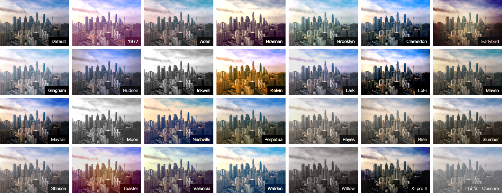
<div class="bruce flex-ct-x" data-title="使用filter模拟Instagram滤镜">
    <ul class="instagram-filter">
      <li>
        <img src="https://static.yangzw.vip/codepen/gz.jpg">
        <p>Default</p>
      </li>
      <li class="_1977">
        <img src="https://static.yangzw.vip/codepen/gz.jpg">
        <p>1977</p>
      </li>
      <li class="aden">
        <img src="https://static.yangzw.vip/codepen/gz.jpg">
        <p>Aden</p>
      </li>
      <li class="brannan">
        <img src="https://static.yangzw.vip/codepen/gz.jpg">
        <p>Brannan</p>
      </li>
      <li class="brooklyn">
        <img src="https://static.yangzw.vip/codepen/gz.jpg">
        <p>Brooklyn</p>
      </li>
      <li class="clarendon">
        <img src="https://static.yangzw.vip/codepen/gz.jpg">
        <p>Clarendon</p>
      </li>
      <li class="earlybird">
        <img src="https://static.yangzw.vip/codepen/gz.jpg">
        <p>Earlybird</p>
      </li>
      <li class="gingham">
        <img src="https://static.yangzw.vip/codepen/gz.jpg">
        <p>Gingham</p>
      </li>
      <li class="hudson">
        <img src="https://static.yangzw.vip/codepen/gz.jpg">
        <p>Hudson</p>
      </li>
      <li class="inkwell">
        <img src="https://static.yangzw.vip/codepen/gz.jpg">
        <p>Inkwell</p>
      </li>
      <li class="kelvin">
        <img src="https://static.yangzw.vip/codepen/gz.jpg">
        <p>Kelvin</p>
      </li>
      <li class="lark">
        <img src="https://static.yangzw.vip/codepen/gz.jpg">
        <p>Lark</p>
      </li>
      <li class="lofi">
        <img src="https://static.yangzw.vip/codepen/gz.jpg">
        <p>LoFi</p>
      </li>
      <li class="maven">
        <img src="https://static.yangzw.vip/codepen/gz.jpg">
        <p>Maven</p>
      </li>
      <li class="mayfair">
        <img src="https://static.yangzw.vip/codepen/gz.jpg">
        <p>Mayfair</p>
      </li>
      <li class="moon">
        <img src="https://static.yangzw.vip/codepen/gz.jpg">
        <p>Moon</p>
      </li>
      <li class="nashville">
        <img src="https://static.yangzw.vip/codepen/gz.jpg">
        <p>Nashville</p>
      </li>
      <li class="perpetua">
        <img src="https://static.yangzw.vip/codepen/gz.jpg">
        <p>Perpetua</p>
      </li>
      <li class="reyes">
        <img src="https://static.yangzw.vip/codepen/gz.jpg">
        <p>Reyes</p>
      </li>
      <li class="rise">
        <img src="https://static.yangzw.vip/codepen/gz.jpg">
        <p>Rise</p>
      </li>
      <li class="slumber">
        <img src="https://static.yangzw.vip/codepen/gz.jpg">
        <p>Slumber</p>
      </li>
      <li class="stinson">
        <img src="https://static.yangzw.vip/codepen/gz.jpg">
        <p>Stinson</p>
      </li>
      <li class="toaster">
        <img src="https://static.yangzw.vip/codepen/gz.jpg">
        <p>Toaster</p>
      </li>
      <li class="valencia">
        <img src="https://static.yangzw.vip/codepen/gz.jpg">
        <p>Valencia</p>
      </li>
      <li class="walden">
        <img src="https://static.yangzw.vip/codepen/gz.jpg">
        <p>Walden</p>
      </li>
      <li class="willow">
        <img src="https://static.yangzw.vip/codepen/gz.jpg">
        <p>Willow</p>
      </li>
      <li class="xpro2">
        <img src="https://static.yangzw.vip/codepen/gz.jpg">
        <p>X-pro II</p>
      </li>
      <li class="obscure">
        <img src="https://static.yangzw.vip/codepen/gz.jpg">
        <p>自定义:Obscure</p>
      </li>
    </ul>
  </div>
.instagram-filter {
  display: flex;
  overflow: auto;
  flex-wrap: wrap;
  justify-content: space-between;
  align-content: space-between;
  width: 1635px;
  max-width: 100%;
  min-height: 630px;
  li {
    overflow: hidden;
    position: relative;
    width: 225px;
    height: 150px;
    &.obscure {
      filter: brightness(80%) grayscale(20%) contrast(1.2) opacity(.6);
    }
  }
  img {
    width: 100%;
    height: 100%;
  }
  p {
    position: absolute;
    right: 0;
    bottom: 0;
    padding: 0 10px;
    width: fit-content;
    height: 30px;
    background-color: #000;
    filter: none;
    line-height: 30px;
    color: #fff;
  }
}
Figure Skill
使用 div 描绘各种图形
使用 mask 雕刻镂空背景
解析
- 要点:通过
mask为图像背景生成蒙层提供遮罩效果 - 场景:高斯模糊蒙层、票劵 (电影票、购物卡)、遮罩动画
- 兼容:mask、perspective、transform-style、animation
- 代码:在线演示

使用 linear-gradient 描绘波浪线
解析
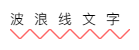
<div class="bruce flex-ct-x" data-title="使用linear-gradient描绘波浪划线">
    <p class="waveline-text">波浪线文字</p>
  </div>
@mixin waveline($h, $color: #f66) {
  position: relative;
  &::after {
    position: absolute;
    left: 0;
    top: 100%;
    width: 100%;
    height: $h;
    background: linear-gradient(135deg, transparent, transparent 45%, $color, transparent 55%, transparent 100%),
      linear-gradient(45deg, transparent, transparent 45%, $color, transparent 55%, transparent 100%);
    background-size: $h * 2 $h * 2;
    content: "";
  }
}
.waveline-text {
  height: 20px;
  line-height: 20px;
  letter-spacing: 10px;
  @include waveline(10px);
}
使用 linear-gradient 描绘彩带
解析
<div class="bruce flex-ct-x" data-title="使用linear-gradient描绘方格彩带">
  <div class="colour-bar"></div>
</div>
.colour-bar {
  width: 500px;
  height: 50px;
  background-image: repeating-linear-gradient(90deg, #f66, #f66 50px, #66f 50px, #66f 100px);
}
使用 conic-gradient 描绘饼图
解析
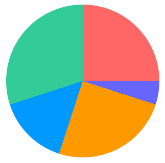
<div class="bruce flex-ct-x" data-title="使用conic-gradient()描绘彩色饼图">
  <div class="pie-chart"></div>
</div>
.pie-chart {
  border-radius: 100%;
  width: 300px;
  height: 300px;
  background-image: conic-gradient(#f66 0 25%, #66f 25% 30%, #f90 30% 55%, #09f 55% 70%, #3c9 70% 100%);
}
使用 linear-gradient 描绘方格背景
解析

<div class="bruce flex-ct-x" data-title="使用linear-gradient描绘方格背景">
  <div class="square-bg"></div>
</div>
.square-bg {
  width: 500px;
  height: 300px;
  background-image: linear-gradient(45deg, #eee 25%, transparent 25%, transparent 75%, #eee 75%),
    linear-gradient(45deg, #eee 25%, transparent 25%, transparent 75%, #eee 75%);
  background-position: 0 0, 20px 20px;
  background-size: 40px 40px;
}
使用 box-shadow 描绘单侧投影
解析
- 要点:通过
box-shadow生成投影,且模糊半径和负的扩张半径一致,使投影偏向一侧 - 场景:容器投影、背景补间动画 1、背景补间动画 2、立体投影、文字立体投影、文字渐变立体投影、长投影、霓虹灯、灯光阴影
- 兼容:box-shadow、filter、text-shadow
- 代码:在线演示

<div class="bruce flex-ct-x" data-title="使用box-shadow描绘单侧投影">
  <div class="aside-shadow">投影</div>
</div>
.aside-shadow {
  display: flex;
  justify-content: center;
  align-items: center;
  border: 1px solid;
  width: 100px;
  height: 100px;
  box-shadow: -7px 0 5px -5px #f90;
  font-weight: bold;
  font-size: 30px;
  color: #f90;
}
使用 filter 描绘头像彩色阴影
解析

<div class="bruce flex-ct-x" data-title="使用filter描绘头像彩色阴影">
  <div class="avatar-shadow"></div>
</div>
$avatar: "https://static.yangzw.vip/codepen/thor.jpg";
.avatar-shadow {
  position: relative;
  border-radius: 100%;
  width: 200px;
  height: 200px;
  background: url($avatar) no-repeat center/cover;
  &::after {
    position: absolute;
    left: 0;
    top: 10%;
    z-index: -1;
    border-radius: 100%;
    width: 100%;
    height: 100%;
    background: inherit;
    filter: blur(10px) brightness(80%) opacity(.8);
    content: "";
    transform: scale(.95);
  }
}
使用 box-shadow 裁剪图像
解析
- 要点:通过
box-shadow模拟蒙层实现中间镂空 - 场景:图片裁剪、新手引导、背景镂空、投射定位
- 兼容:box-shadow
- 代码:在线演示
<div class="bruce flex-ct-x" data-title="使用box-shadow裁剪聚焦区域">
  <div class="img-cliper">
    <img src="https://static.yangzw.vip/codepen/gz.jpg">
    <i></i>
  </div>
</div>
.img-cliper {
  overflow: hidden;
  position: relative;
  img {
    width: 400px;
  }
  i {
    position: absolute;
    left: 50px;
    top: 30px;
    border-radius: 100%;
    width: 100px;
    height: 50px;
    box-shadow: 0 0 0 9999px rgba(#000, .5);
  }
}
<div class="bruce flex-ct-x" data-title="使用box-shadow裁剪聚焦区域">
<div class="img-cliper">
<img src="https://pics.dmm.co.jp/digital/video/pred00172/pred00172jp-1.jpg">
<i></i>
</div>
</div>
.img-cliper {
  overflow: hidden;
  position: relative;
  img {
    width: 400px;
  }
  i {
    position: absolute;
    left: 160px;
    top: 35px;
    border-radius: 100%;
    width: 120px;
    height: 120px;
    box-shadow: 0 0 0 9999px rgba(#000, .8);
  }
}
使用 outline 描绘内边框
解析
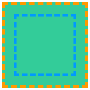
<div class="bruce flex-ct-x" data-title="使用outline描绘内部边框">
  <div class="outside-border"></div>
</div>
.outside-border {
  border: 10px dashed #f90;
  width: 300px;
  height: 300px;
  outline: 10px dashed #09f;
  outline-offset: -50px;
  background-color: #3c9;
}
Component Skill
迭代计数器
解析
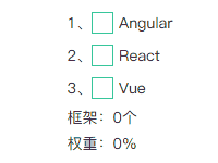
<div class="bruce flex-ct-x" data-title="迭代计数器">
  <div class="iterative-counter">
    <ul>
      <li>
        <input id="angular" type="checkbox">
        <label for="angular">Angular</label>
      </li>
      <li>
        <input id="react" type="checkbox">
        <label for="react">React</label>
      </li>
      <li>
        <input id="vue" type="checkbox">
        <label for="vue">Vue</label>
      </li>
    </ul>
    <p class="count" data-unit="个">框架:</p>
    <p class="weight" data-unit="%">权重:</p>
  </div>
</div>
.iterative-counter {
  ul {
    counter-reset: index 0 count 0 weight 0;
  }
  li {
    display: flex;
    position: relative;
    align-items: center;
    counter-increment: index 1;
    &::before {
      content: counter(index)"、";
    }
    & + li {
      margin-top: 10px;
    }
  }
  input {
    overflow: hidden;
    position: absolute;
    width: 0;
    height: 0;
    opacity: 0;
    &:checked + label::before {
      color: #3c9;
      content: "\2713";
    }
  }
  label {
    display: flex;
    align-items: center;
    height: 20px;
    &::before {
      margin-right: 5px;
      border: 1px solid #3c9;
      width: 20px;
      height: 20px;
      cursor: pointer;
      line-height: 20px;
      text-align: center;
      color: transparent;
      content: "";
      transition: all 300ms;
    }
  }
  p {
    margin-top: 10px;
    &.count::after {
      content: counter(count) attr(data-unit);
    }
    &.weight::after {
      content: counter(weight) attr(data-unit);
    }
  }
}
#angular:checked {
  counter-increment: count 1 weight 20;
}
#react:checked {
  counter-increment: count 1 weight 50;
}
#vue:checked {
  counter-increment: count 1 weight 30;
}
下划线跟随导航栏
解析

<div class="bruce flex-ct-x" data-title="下划线跟随导航栏">
  <ul class="underline-navbar">
    <li>Alibaba阿里巴巴</li>
    <li>Tencent腾讯</li>
    <li>Baidu百度</li>
    <li>Jingdong京东</li>
    <li>Ant蚂蚁金服</li>
    <li>Netease网易</li>
  </ul>
</div>
.underline-navbar {
  display: flex;
  li {
    position: relative;
    padding: 10px;
    cursor: pointer;
    font-size: 20px;
    color: #09f;
    transition: all 300ms;
    &::before {
      position: absolute;
      left: 100%;
      top: 0;
      border-bottom: 2px solid transparent;
      width: 0;
      height: 100%;
      content: "";
      transition: all 300ms;
    }
    &:active {
      background-color: #09f;
      color: #fff;
    }
    &:hover {
      &::before {
        left: 0;
        top: 0;
        z-index: -1;
        border-bottom-color: #09f;
        width: 100%;
        transition-delay: 100ms;
      }
      & + li::before {
        left: 0;
      }
    }
  }
}
气泡背景墙
解析

<div class="bruce" data-title="气泡背景墙">
  <ul class="bubble-bgwall">
    <li>Love</li>
    <li>Love</li>
    <li>Love</li>
    <li>Love</li>
    <li>Love</li>
    <li>Love</li>
    <li>Love</li>
    <li>Love</li>
    <li>Love</li>
    <li>Love</li>
  </ul>
</div>
.bruce {
  background-image: linear-gradient(270deg, #8146b4, #6990f6);
}
.bubble-bgwall {
  overflow: hidden;
  position: relative;
  margin: 0 auto;
  width: 100%;
  max-width: 1200px;
  height: 100%;
  li {
    display: flex;
    position: absolute;
    bottom: -200px;
    justify-content: center;
    align-items: center;
    border-radius: 10px;
    width: 50px;
    height: 50px;
    background-color: rgba(#fff, .15);
    color: #ccc;
    animation: bubble 15s infinite;
    &:nth-child(1) {
      left: 10%;
    }
    &:nth-child(2) {
      left: 20%;
      width: 90px;
      height: 90px;
      animation-duration: 7s;
      animation-delay: 2s;
    }
    &:nth-child(3) {
      left: 25%;
      animation-delay: 4s;
    }
    &:nth-child(4) {
      left: 40%;
      width: 60px;
      height: 60px;
      background-color: rgba(#fff, .3);
      animation-duration: 8s;
    }
    &:nth-child(5) {
      left: 70%;
    }
    &:nth-child(6) {
      left: 80%;
      width: 120px;
      height: 120px;
      background-color: rgba(#fff, .2);
      animation-delay: 3s;
    }
    &:nth-child(7) {
      left: 32%;
      width: 160px;
      height: 160px;
      animation-delay: 2s;
    }
    &:nth-child(8) {
      left: 55%;
      width: 40px;
      height: 40px;
      font-size: 12px;
      animation-duration: 15s;
      animation-delay: 4s;
    }
    &:nth-child(9) {
      left: 25%;
      width: 40px;
      height: 40px;
      background-color: rgba(#fff, .3);
      font-size: 12px;
      animation-duration: 12s;
      animation-delay: 2s;
    }
    &:nth-child(10) {
      left: 85%;
      width: 160px;
      height: 160px;
      animation-delay: 5s;
    }
  }
}
@keyframes bubble {
  0% {
    opacity: .5;
    transform: translateY(0) rotate(45deg);
  }
  25% {
    opacity: .75;
    transform: translateY(-400px) rotate(90deg);
  }
  50% {
    opacity: 1;
    transform: translateY(-600px) rotate(135deg);
  }
  100% {
    opacity: 0;
    transform: translateY(-1000px) rotate(180deg);
  }
}
滚动指示器
解析

<div class="bruce flex-ct-x" data-title="滚动指示器">
  <div class="scroll-indicator">
    <div>
      <article>
        <h1>2019中国互联网企业100强榜单</h1>
        <p>8月14日,中国互联网协会、工业和信息化部网络安全产业发展中心(工业和信息化部信息中心)在2019年中国互联网企业100强发布会暨百强企业高峰论坛上联合发布了2019年中国互联网企业100强榜单、互联网成长型企业20强榜单和《2019年中国互联网企业100强发展报告》.阿里巴巴(中国)有限公司、深圳市腾讯计算机系统有限责任公司、百度公司、京东集团、浙江蚂蚁小微金融服务集团股份有限公司、网易集团、美团点评、北京字节跳动科技有限公司、三六零安全科技股份有限公司、新浪公司位列榜单前十名.</p>
        <p>今年互联网百强企业聚焦创新引领、产业融合、工业互联网等方面,主要呈现出六大特点:</p>
        <p>一是整体规模跨越式提升,成为数字经济新引擎.2019年互联网百强企业互联网业务收入高达2.75万亿元,比2018年互联网百强企业互联网业务收入增长超过1万亿元,占我国数字经济的比重达8.8%,对数字经济的贡献率达14%,带动数字经济增长近2个百分点成为带动我国互联网产业发展的重要支撑.从互联网业务收入增长率分布看,有86家企业互联网业务收入实现增长.</p>
        <p>二是研发投入强度突破10%,打造中国核心技术.2019年互联网百强企业的研发投入达到1538.7亿元,同比增长45.1%,平均研发强度突破10%,比我国R&D经费投入强度高出近8个百分点.从研发强度分布看,有40家企业研发强度在10%以上,4家企业研发强度在30%-35%之间.互联网百强企业不断突破核心技术,互联网百强企业不断提升原始创新能力,加快推进5G、人工智能、云计算、大数据等关键核心技术突破,部分技术处于国际领先水平.2019年互联网百强企业已经拥有专利近8万项,其中发明专利数近6万项.2019年互联网百强企业中应用大数据企业29家,云计算28家,人工智能相关企业24家,运用物联网技术相关的企业3家.</p>
        <p>三是应用场景多元化,智能+打造生活消费新模式.互联网百强企业深化消费互联网发展,已对衣、食、住、行等各方面进行了全场景覆盖,业务涵盖互联网公共服务、网络媒体、音乐与视频、社交网络、科技创新与知识产权等17个领域,全方位提升了人民群众的生活、工作、文化、娱乐、教育等方面的生活质量.2019年互联网百强企业中从事电子商务的共18家;涉及互联网公共服务的共41家,主要提供信息查询、教育医疗、政务办理、公共出行等便民服务,让普通人民享受到"互联网+"带来的便利生活;21家企业涉及音乐与视频业务.同时,互联网百强企业积极发展智能产业,不断拓展"智能+",创造了智慧门店、VR/AR试衣试妆、无感支付等丰富的新消费业态和场景,打造未来智能生活消费新模式.</p>
        <p>四是工业互联网入实践深耕,赋能传统产业高质量发展.互联网百强企业通过不断向各行各业"渗透"和"赋能",推动云计算、大数据、物联网等信息通信技术与实体经济深入融合,培育新产业、新业态、新模式,支撑实体经济高质量发展.2019年互联网百强企业产业互联网数量再创新高,以服务实体经济客户为主的产业互联网领域企业数量达到60家,累计服务近4000万家企业.其中,涉及互联网数据服务41家,生产制造服务13家,科技创新和知识产权24家,B2B电商11家,互联网基础服务10家.</p>
        <p>五是"独角兽" 企业快速增长,国际行业地位再创新高.2019年互联网百强企业及下属企业涌现出蚂蚁金服、字节跳动、京东数科、满帮集团、优刻得、找钢网等25家独角兽企业,同比增长38.9%,业务涉及金融科技、智慧物流、电子商务、新文娱等领域.从全球公司市值排名情况看,2018年,全球互联网公司市值前三十强中互联网百强企业占10家,其中,腾讯集团和阿里巴巴稳居全球互联网公司市值前十强.</p>
        <p>六是覆盖地域实现新扩展,网络扶贫取得新成效.2019年拥有互联网百强企业的省份达到18个,在2018年基础上新增江西和山东两个省份,地域覆盖不断增加.在区域分布上,东部地区互联网百强企业数量共86家,中西部地区互联网百强企业共12家,东北地区互联网百强企业数量保持2家.其中,安徽、贵州、河南、湖北、湖南、江西、重庆、四川8个中西部地区互联网百强企业数量不断增加,较去年增长1家.互联网百强企业积极践行企业社会责任,发挥互联网在助推脱贫攻坚中的作用,探索"直播+电商"等扶贫新模式,推进精准扶贫、精准脱贫.据统计,超过一半以上互联网百强企业参与网络扶贫.</p>
      </article>
    </div>
  </div>
</div>
.scroll-indicator {
  overflow: hidden;
  position: relative;
  border: 1px solid #66f;
  width: 500px;
  height: 300px;
  &::after {
    position: absolute;
    left: 0;
    right: 5px;
    top: 2px;
    bottom: 0;
    background-color: #fff;
    content: "";
  }
  div {
    overflow: auto;
    height: 100%;
    &::-webkit-scrollbar {
      width: 5px;
    }
    &::-webkit-scrollbar-track {
      background-color: #f0f0f0;
    }
    &::-webkit-scrollbar-thumb {
      border-radius: 2px;
      background-color: #66f;
    }
  }
  article {
    padding: 0 20px;
    background: linear-gradient(to right top, #f66 50%, #f0f0f0 50%) no-repeat;
    background-size: 100% calc(100% - 298px + 5px);
    > * {
      position: relative;
      z-index: 9;
    }
  }
  h1 {
    line-height: 40px;
    text-align: center;
    font-size: 20px;
  }
  p {
    margin-top: 20px;
    line-height: 20px;
    text-indent: 2em;
  }
}
故障文本
解析

<div class="bruce flex-ct-x" data-title="故障文本">
  <div class="fault-text" data-text="ERROR">ERROR</div>
</div>
.bruce {
  background-color: #000;
}
.fault-text {
  position: relative;
  font-weight: bold;
  font-size: 100px;
  color: #fff;
  &::before,
  &::after {
    overflow: hidden;
    position: absolute;
    top: 0;
    background-color: #000;
    clip: rect(0, 900px, 0, 0);
    color: #fff;
    content: attr(data-text);
    animation: shake 3s linear infinite alternate-reverse;
  }
  &::before {
    left: -2px;
    text-shadow: 1px 0 #09f;
  }
  &::after {
    left: 2px;
    text-shadow: -1px 0 #f66;
    animation-duration: 2s;
  }
}
@keyframes shake {
  $steps: 20;
  @for $i from 0 through $steps {
    #{percentage($i * (1 / $steps))} {
      clip: rect(random(100) + px, 9999px, random(100) + px, 0);
    }
  }
}
换色器
解析
- 要点:通过拾色器改变图像色相的换色器
- 场景:图片色彩变换
- 兼容:mix-blend-mode
- 代码:在线演示
<div class="bruce" data-title="图像换色器">
  <div class="color-changer">
    <input type="color" value="#ff6666">
    <img src="https://static.yangzw.vip/codepen/car.jpg">
  </div>
</div>
.color-changer {
  overflow: hidden;
  position: relative;
  height: 100%;
  input {
    position: absolute;
    width: 100%;
    height: 100%;
    mix-blend-mode: hue;
    cursor: pointer;
  }
  img {
    width: 100%;
    height: 100%;
    object-fit: cover;
  }
}
状态悬浮球
解析

<div class="bruce flex-ct-x" data-title="状态悬浮球">
  <div class="state-ball warning">
    <div class="wave"></div>
  </div>
</div>
.state-ball {
  overflow: hidden;
  position: relative;
  padding: 5px;
  border: 3px solid #3c9;
  border-radius: 100%;
  width: 150px;
  height: 150px;
  background-color: #fff;
  &::before,
  &::after {
    position: absolute;
    left: 50%;
    top: 0;
    z-index: 20;
    margin-left: -100px;
    width: 200px;
    height: 200px;
    content: "";
  }
  &::before {
    margin-top: -150px;
    border-radius: 45%;
    background-color: rgba(#fff, .5);
    animation: rotate 10s linear -5s infinite;
  }
  &::after {
    margin-top: -160px;
    border-radius: 40%;
    background-color: rgba(#fff, .8);
    animation: rotate 15s infinite;
  }
  &.warning {
    border-color: #f90;
    .wave {
      background-image: linear-gradient(-180deg, #f0c78a 13%, #f90 91%);
    }
  }
  &.danger {
    border-color: #f66;
    .wave {
      background-image: linear-gradient(-180deg, #f78989 13%, #f66 91%);
    }
  }
  .wave {
    position: relative;
    border-radius: 100%;
    width: 100%;
    height: 100%;
    background-image: linear-gradient(-180deg, #af8 13%, #3c9 91%);
  }
}
@keyframes rotate {
  to {
    transform: rotate(1turn);
  }
}
粘粘球
解析

<div class="bruce flex-ct-x" data-title="粘粘球">
  <ul class="sticky-ball">
    <li class="ball-1"></li>
    <li class="ball-2"></li>
  </ul>
</div>
.sticky-ball {
  position: relative;
  width: 320px;
  height: 80px;
  filter: contrast(10);
  li {
    position: absolute;
    top: 0;
    padding: 10px;
    border-radius: 100%;
    width: 80px;
    height: 80px;
    background-color: #f66;
    filter: blur(5px);
    animation: 6s infinite;
    &.ball-1 {
      left: 0;
      animation-name: move-1 !important;
    }
    &.ball-2 {
      left: 240px;
      animation-name: move-2 !important;
    }
  }
}
@keyframes move-1 {
  0%,
  20%,
  100% {
    width: 80px;
    height: 80px;
  }
  50% {
    left: 110px;
    top: -15px;
    width: 110px;
    height: 110px;
  }
  85% {
    left: 75px;
    width: 90px;
    height: 70px;
  }
  90% {
    top: -2px;
    width: 75px;
    height: 85px;
  }
}
@keyframes move-2 {
  0%,
  20%,
  100% {
    width: 80px;
    height: 80px;
  }
  50% {
    left: 110px;
    top: -15px;
    width: 110px;
    height: 110px;
  }
  85% {
    left: 165px;
    width: 90px;
    height: 70px;
  }
  90% {
    top: -2px;
    width: 75px;
    height: 85px;
  }
}
商城票券
解析

<div class="bruce flex-ct-x" data-title="商城票券">
  <div class="mall-ticket">
    <h3>100元</h3>
    <p>网易考拉代金券</p>
  </div>
</div>
.mall-ticket {
  display: flex;
  position: relative;
  width: 300px;
  height: 100px;
  background: radial-gradient(circle at right top, transparent 10px, #f66 0) top left/100px 51% no-repeat,
    radial-gradient(circle at right bottom, transparent 10px, #f66 0) bottom left/100px 51% no-repeat,
    radial-gradient(circle at left top, transparent 10px, #ccc 0) top right/200px 51% no-repeat,
    radial-gradient(circle at left bottom, transparent 10px, #ccc 0) bottom right/200px 51% no-repeat;
  filter: drop-shadow(2px 2px 2px rgba(#fff, .2));
  line-height: 100px;
  text-align: center;
  color: #fff;
  &::before {
    position: absolute;
    left: 100px;
    top: 0;
    bottom: 0;
    margin: auto;
    border: 1px dashed #66f;
    height: 80px;
    content: "";
  }
  &::after {
    position: absolute;
    left: 100%;
    top: 0;
    width: 5px;
    height: 100%;
    background-image: linear-gradient(180deg, #ccc 5px, transparent 5px, transparent),
      radial-gradient(10px circle at 5px 10px, transparent 5px, #ccc 5px);
    background-size: 5px 15px;
    content: "";
  }
  h3 {
    width: 100px;
    font-size: 30px;
  }
  p {
    flex: 1;
    font-weight: bold;
    font-size: 18px;
  }
}
倒影加载条
解析
- 要点:带有渐变倒影的加载条
- 场景:加载提示
- 兼容:box-reflect、animation
- 代码:在线演示
<div class="bruce flex-ct-x" data-title="倒影加载条">
  <ul class="reflect-loading">
    <li></li>
    <li></li>
    <li></li>
    <li></li>
    <li></li>
    <li></li>
    <li></li>
    <li></li>
    <li></li>
    <li></li>
  </ul>
</div>
$count: 10;
$color: #66f #09f;
.reflect-loading {
  display: flex;
  height: 100px;
  -webkit-box-reflect: below 0 linear-gradient(rgba(#fff, 0), rgba(#fff, .7));
  li {
    width: 20px;
    @for $i from 0 to $count {
      $args: append($color, $i * 100% / ($count - 1));
      &:nth-child(#{$i + 1}) {
        background-color: mix($args...);
        animation: rotate 3s cubic-bezier(.81, .04, .4, .7) infinite;
        animation-delay: $i * 50ms;
      }
    }
  }
}
@keyframes rotate {
  0% {
    transform: rotate(-.5turn) rotateX(-1turn);
  }
  75%,
  100% {
    transform: none;
  }
}
三维立方体
解析
- 要点:三维建模的立方体
- 场景:三维建模
- 兼容:transform、perspective、transform-style、animation
- 代码:在线演示
<div class="bruce flex-ct-x" data-title="三维立方体">
  <div class="td-cube">
    <ul>
      <li class="front">1</li>
      <li class="back">2</li>
      <li class="top">3</li>
      <li class="bottom">4</li>
      <li class="left">5</li>
      <li class="right">6</li>
    </ul>
  </div>
</div>
$width: 150px;
$height: 150px;
$length: 150px;
.td-cube {
  width: $width;
  height: $height;
  perspective: 1000px;
  ul {
    position: relative;
    width: 100%;
    height: 100%;
    transform: rotateX(-15deg) rotateY(15deg);
    transform-style: preserve-3d;
    animation: rotate 5s infinite linear;
  }
  li {
    display: flex;
    position: absolute;
    justify-content: center;
    align-items: center;
    width: $width;
    height: $height;
    opacity: .8;
    font-size: 50px;
    color: #fff;
    &.front {
      background-color: #f66;
      transform: translateZ($length / 2);
    }
    &.back {
      background-color: #66f;
      transform: rotateY(180deg) translateZ($length / 2);
    }
    &.top {
      background-color: #f90;
      transform: rotateX(90deg) translateZ($height / 2);
    }
    &.bottom {
      background-color: #09f;
      transform: rotateX(-90deg) translateZ($height / 2);
    }
    &.left {
      background-color: #9c3;
      transform: rotateY(-90deg) translateZ($width / 2);
    }
    &.right {
      background-color: #3c9;
      transform: rotateY(90deg) translateZ($width / 2);
    }
  }
}
@keyframes rotate {
  from {
    transform: rotateY(0) rotateX(0);
  }
  to {
    transform: rotateY(-1turn) rotateX(-1turn);
  }
}
动态边框
解析
<div class="bruce flex-ct-x" data-title="悬浮边框按钮">
  <div class="dynamic-border">iCSS</div>
</div>
.dynamic-border {
width: 200px;
height: 80px;
background: linear-gradient(0, #f66 2px, #f66 2px) no-repeat left top/0 2px,
linear-gradient(-90deg, #f66 2px, #f66 2px) no-repeat right top/2px 0,
linear-gradient(-180deg, #f66 2px, #f66 2px) no-repeat right bottom/0 2px,
linear-gradient(-270deg, #f66 2px, #f66 2px) no-repeat left bottom/2px 0;
cursor: pointer;
line-height: 80px;
text-align: center;
font-weight: bold;
font-size: 50px;
color: #f66;
transition: all 300ms;
&:hover {
background-size: 100% 2px, 2px 100%, 100% 2px, 2px 100%;
}
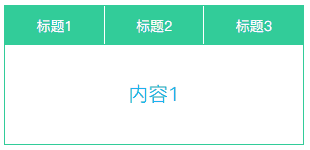
}标签页
解析
- 要点:可切换内容的标签页
- 场景:内容切换
- 兼容:scroll-behavior
- 代码:在线演示
<div class="bruce flex-ct-x" data-title="标签选框">
  <div class="tab-page">
    <nav>
      <h3>
        <input type="radio" name="tab">
        <label for="tab1">标题1</label>
      </h3>
      <h3>
        <input type="radio" name="tab">
        <label for="tab2">标题2</label>
      </h3>
      <h3>
        <input type="radio" name="tab">
        <label for="tab3">标题3</label>
      </h3>
    </nav>
    <ul>
      <li>
        <input id="tab1">
        <p>内容1</p>
      </li>
      <li>
        <input id="tab2">
        <p>内容2</p>
      </li>
      <li>
        <input id="tab3">
        <p>内容3</p>
      </li>
    </ul>
  </div>
</div>
.tab-page {
  width: 300px;
  nav {
    display: flex;
    border: 1px solid #3c9;
    height: 40px;
    line-height: 40px;
    text-align: center;
    h3 {
      position: relative;
      flex: 1;
      background-color: #3c9;
      color: #fff;
      & + h3 {
        border-left: 1px solid #fff;
      }
    }
    input {
      display: none;
    }
    label {
      display: block;
      width: 100%;
      height: 100%;
      cursor: pointer;
    }
  }
  ul {
    overflow: hidden;
    scroll-behavior: smooth;
    border: 1px solid #3c9;
    border-top: none;
    height: 100px;
    li {
      display: flex;
      position: relative;
      justify-content: center;
      align-items: center;
      height: 100%;
      font-size: 20px;
      color: #09f;
    }
    input {
      position: absolute;
      width: 0;
      height: 0;
      opacity: 0;
    }
  }
}
标签导航栏
解析
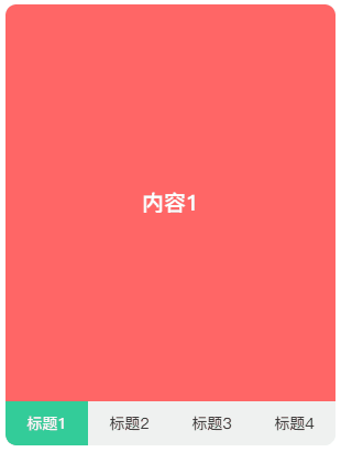
<div class="bruce flex-ct-x" data-title="标签导航">
  <div class="tab-navbar">
    <input id="tab1" type="radio" name="tabs" hidden checked>
    <input id="tab2" type="radio" name="tabs" hidden>
    <input id="tab3" type="radio" name="tabs" hidden>
    <input id="tab4" type="radio" name="tabs" hidden>
    <nav>
      <label for="tab1">标题1</label>
      <label for="tab2">标题2</label>
      <label for="tab3">标题3</label>
      <label for="tab4">标题4</label>
    </nav>
    <main>
      <ul>
        <li>内容1</li>
        <li>内容2</li>
        <li>内容3</li>
        <li>内容4</li>
      </ul>
    </main>
  </div>
</div>
.active {
  background-color: #3c9;
  color: #fff;
}
.tab-navbar {
  display: flex;
  overflow: hidden;
  flex-direction: column-reverse;
  border-radius: 10px;
  width: 300px;
  height: 400px;
  input {
    &:nth-child(1):checked {
      & ~ nav label:nth-child(1) {
        @extend .active;
      }
      & ~ main ul {
        background-color: #f66;
        transform: translate3d(0, 0, 0);
      }
    }
    &:nth-child(2):checked {
      & ~ nav label:nth-child(2) {
        @extend .active;
      }
      & ~ main ul {
        background-color: #66f;
        transform: translate3d(-25%, 0, 0);
      }
    }
    &:nth-child(3):checked {
      & ~ nav label:nth-child(3) {
        @extend .active;
      }
      & ~ main ul {
        background-color: #f90;
        transform: translate3d(-50%, 0, 0);
      }
    }
    &:nth-child(4):checked {
      & ~ nav label:nth-child(4) {
        @extend .active;
      }
      & ~ main ul {
        background-color: #09f;
        transform: translate3d(-75%, 0, 0);
      }
    }
  }
  nav {
    display: flex;
    height: 40px;
    background-color: #f0f0f0;
    line-height: 40px;
    text-align: center;
    label {
      flex: 1;
      cursor: pointer;
      transition: all 300ms;
    }
  }
  main {
    flex: 1;
    ul {
      display: flex;
      flex-wrap: nowrap;
      width: 400%;
      height: 100%;
      transition: all 300ms;
    }
    li {
      display: flex;
      justify-content: center;
      align-items: center;
      flex: 1;
      font-weight: bold;
      font-size: 20px;
      color: #fff;
    }
  }
}
折叠面板
解析
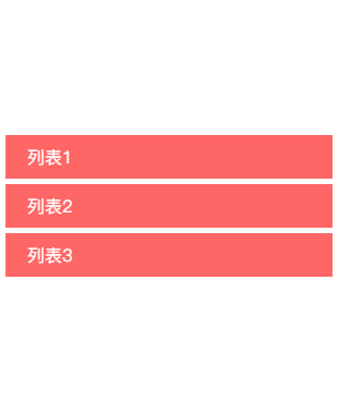
<div class="bruce flex-ct-x" data-title="折叠面板">
  <div class="accordion">
    <input id="collapse1" type="checkbox">
    <input id="collapse2" type="checkbox">
    <input id="collapse3" type="checkbox">
    <article>
      <label for="collapse1">列表1</label>
      <p>内容1<br>内容2<br>内容3<br>内容4</p>
    </article>
    <article>
      <label for="collapse2">列表2</label>
      <p>内容1<br>内容2<br>内容3<br>内容4</p>
    </article>
    <article>
      <label for="collapse3">列表3</label>
      <p>内容1<br>内容2<br>内容3<br>内容4</p>
    </article>
  </div>
</div>
.accordion {
  width: 300px;
  article {
    cursor: pointer;
    & + article {
      margin-top: 5px;
    }
  }
  input {
    display: none;
    &:nth-child(1):checked ~ article:nth-of-type(1) p,
    &:nth-child(2):checked ~ article:nth-of-type(2) p,
    &:nth-child(3):checked ~ article:nth-of-type(3) p {
      border-bottom-width: 1px;
      max-height: 600px;
    }
  }
  label {
    display: block;
    padding: 0 20px;
    height: 40px;
    background-color: #f66;
    cursor: pointer;
    line-height: 40px;
    font-size: 16px;
    color: #fff;
  }
  p {
    overflow: hidden;
    padding: 0 20px;
    border: 1px solid #f66;
    border-top: none;
    border-bottom-width: 0;
    max-height: 0;
    line-height: 30px;
    transition: all 500ms;
  }
}
星级评分
解析
<div class="bruce flex-ct-x" data-title="星级评分">
  <div class="star-rating">
    <input type="radio" name="rate">
    <input type="radio" name="rate">
    <input type="radio" name="rate">
    <input type="radio" name="rate">
    <input type="radio" name="rate">
  </div>
</div>
.star-rating {
  display: flex;
  flex-direction: row-reverse;
  input {
    width: 30px;
    height: 30px;
    appearance: none;
    cursor: pointer;
    line-height: 30px;
    text-align: center;
    font-size: 30px;
    transition: all 300ms;
    &::after {
      color: #66f;
      content: "☆";
      transition: all 300ms;
    }
    &:hover {
      transform: scale(1.2);
    }
    &:checked,
    &:hover {
      &::after,
      & ~ input::after {
        color: #f66;
        content: "★";
      }
    }
  }
}
加载指示器
解析

<div class="bruce flex-ct-x" data-title="加载指示器">
  <div class="loading-indicator">加载中<span></span></div>
</div>
.loading-indicator {
  font-size: 16px;
  color: #09f;
  span {
    display: inline-block;
    overflow: hidden;
    height: 1em;
    line-height: 1;
    vertical-align: -.25em;
    &::after {
      display: block;
      white-space: pre-wrap;
      content: "...\A..\A.";
      animation: loading 3s infinite step-start both;
    }
  }
}
@keyframes loading {
  33% {
    transform: translate3d(0, -2em, 0);
  }
  66% {
    transform: translate3d(0, -1em, 0);
  }
}
自适应相册
解析
- 要点:自适应照片数量的相册
- 场景:九宫格相册、微信相册、图集
- 兼容::only-child、:first-child、:nth-child()、:nth-last-child()、~
- 代码:在线演示
<div class="bruce flex-ct-x" data-title="自适应相册">
    <ul class="response-album">
      <li class="item"><img src="//static.yangzw.vip/codepen/ab-3.jpg"></li>
      <li class="item"><img src="//static.yangzw.vip/codepen/ab-3.jpg"></li>
      <li class="item"><img src="//static.yangzw.vip/codepen/ab-3.jpg"></li>
      <li class="item"><img src="//static.yangzw.vip/codepen/ab-3.jpg"></li>
      <li class="item"><img src="//static.yangzw.vip/codepen/ab-3.jpg"></li>
      <li class="item"><img src="//static.yangzw.vip/codepen/ab-3.jpg"></li>
      <li class="item"><img src="//static.yangzw.vip/codepen/ab-3.jpg"></li>
      <li class="item"><img src="//static.yangzw.vip/codepen/ab-3.jpg"></li>
      <li class="item"><img src="//static.yangzw.vip/codepen/ab-3.jpg"></li>
    </ul>
  </div>
@mixin square($count: 2) {
  $length: calc((100% - #{$count} * 10px) / #{$count});
  width: $length;
  height: $length;
}
.response-album {
  display: flex;
  flex-wrap: wrap;
  justify-content: flex-start;
  align-content: flex-start;
  padding: 5px;
  border: 1px solid #ccc;
  border-radius: 5px;
  width: 400px;
  height: 400px;
  li {
    display: flex;
    overflow: hidden;
    justify-content: center;
    margin: 5px;
    background-color: #f0f0f0;
    @include square(3);
  }
  img {
    width: 100%;
    height: 100%;

  object-fit: cover;
}

}
// 一个元素
.item:only-child {
border-radius: 10px;
width: auto;
max-width: 80%;
height: auto;
max-height: 80%;
}
// 两个元素
.item:first-child:nth-last-child(2),
.item:first-child:nth-last-child(2) ~ .item:nth-child(2) {
@include square(2);
}
.item:first-child:nth-last-child(2) {
border-radius: 10px 0 0 10px;
}
.item:first-child:nth-last-child(2) ~ .item:nth-child(2) {
border-radius: 0 10px 10px 0;
}
// 三个元素
.item:first-child:nth-last-child(3),
.item:first-child:nth-last-child(3) ~ .item:nth-child(2),
.item:first-child:nth-last-child(3) ~ .item:nth-child(3) {
@include square(2);
}
.item:first-child:nth-last-child(3) {
border-top-left-radius: 10px;
}
.item:first-child:nth-last-child(3) ~ .item:nth-child(2) {
border-top-right-radius: 10px;
}
.item:first-child:nth-last-child(3) ~ .item:nth-child(3) {
border-bottom-left-radius: 10px;
}
// 四个元素
.item:first-child:nth-last-child(4),
.item:first-child:nth-last-child(4) ~ .item:nth-child(2),
.item:first-child:nth-last-child(4) ~ .item:nth-child(3),
.item:first-child:nth-last-child(4) ~ .item:nth-child(4) {
@include square(2);
}
.item:first-child:nth-last-child(4) {
border-top-left-radius: 10px;
}
.item:first-child:nth-last-child(4) ~ .item:nth-child(2) {
border-top-right-radius: 10px;
}
.item:first-child:nth-last-child(4) ~ .item:nth-child(3) {
border-bottom-left-radius: 10px;
}
.item:first-child:nth-last-child(4) ~ .item:nth-child(4) {
border-bottom-right-radius: 10px;
}
// 五个元素
.item:first-child:nth-last-child(5) {
border-top-left-radius: 10px;
}
.item:first-child:nth-last-child(5) ~ .item:nth-child(3) {
border-top-right-radius: 10px;
}
.item:first-child:nth-last-child(5) ~ .item:nth-child(4) {
border-bottom-left-radius: 10px;
}
// 六个元素
.item:first-child:nth-last-child(6) {
border-top-left-radius: 10px;
}
.item:first-child:nth-last-child(6) ~ .item:nth-child(3) {
border-top-right-radius: 10px;
}
.item:first-child:nth-last-child(6) ~ .item:nth-child(4) {
border-bottom-left-radius: 10px;
}
.item:first-child:nth-last-child(6) ~ .item:nth-child(6) {
border-bottom-right-radius: 10px;
}
// 七个元素
.item:first-child:nth-last-child(7) {
border-top-left-radius: 10px;
}
.item:first-child:nth-last-child(7) ~ .item:nth-child(3) {
border-top-right-radius: 10px;
}
.item:first-child:nth-last-child(7) ~ .item:nth-child(7) {
border-bottom-left-radius: 10px;
}
// 八个元素
.item:first-child:nth-last-child(8) {
border-top-left-radius: 10px;
}
.item:first-child:nth-last-child(8) ~ .item:nth-child(3) {
border-top-right-radius: 10px;
}
.item:first-child:nth-last-child(8) ~ .item:nth-child(7) {
border-bottom-left-radius: 10px;
}
// 九个元素
.item:first-child:nth-last-child(9) {
border-top-left-radius: 10px;
}
.item:first-child:nth-last-child(9) ~ .item:nth-child(3) {
border-top-right-radius: 10px;
}
.item:first-child:nth-last-child(9) ~ .item:nth-child(7) {
border-bottom-left-radius: 10px;
}
.item:first-child:nth-last-child(9) ~ .item:nth-child(9) {
border-bottom-right-radius: 10px;
}
圆角进度条
解析

<div class="bruce flex-ct-x" data-title="圆角进度条">
  <div class="fillet-progressbar"></div>
</div>
@mixin progress-bar($width: 100px, $height: 10px, $color: #f66, $percent: 0) {
  border-radius: $height / 2;
  width: $width;
  height: $height;
  background-color: #ccc;
  background-image: radial-gradient(closest-side circle at $percent, $color, $color 100%, transparent),
    linear-gradient($color, $color);
  background-repeat: no-repeat;
  background-size: 100%, $percent;
}
.fillet-progressbar {
  @include progress-bar(500px, 10px, #66f, 50%);
}
螺纹进度条
解析

<div class="bruce flex-ct-x" data-title="螺纹进度条">
  <div class="thread-progressbar"></div>
</div>
.thread-progressbar {
  position: relative;
  padding-right: 200px;
  width: 500px;
  height: calc(1.4142 * 20px);
  background: repeating-linear-gradient(45deg, #3c9, #3c9 10px, transparent 11px, transparent 19px, #3c9 20px) 0 0 content-box;
  animation: twill 1s linear infinite;
  &::after {
    position: absolute;
    width: 100%;
    height: 100%;
    background-image: linear-gradient(rgba(#000, .5), rgba(#fff, .5), rgba(#000, .5));
    content: "";
  }
}
@keyframes twill {
  to {
    background-position-y: calc(-1 * 1.4142 * 40px);
  }
}
立体按钮
解析
- 要点:点击呈现按下状态的按钮
- 场景:按钮点击
- 兼容:box-shadow
- 代码:在线演示

<div class="bruce flex-ct-x" data-title="立体按钮">
  <button class="stereo-btn">iCSS</button>
</div>
.stereo-btn {
  padding: 10px 20px;
  border: none;
  border-radius: 10px;
  outline: none;
  background-image: linear-gradient(#09f, #3c9);
  box-shadow: 0 10px 0 #09f;
  cursor: pointer;
  text-shadow: 0 5px 5px #ccc;
  font-size: 50px;
  color: #fff;
  transition: all 300ms;
  &:active {
    box-shadow: 0 5px 0 #09f;
    transform: translate3d(0, 5px, 0);
  }
}
混沌加载圈
解析
<div class="bruce flex-ct-x" data-title="混沌加载圈">
  <ul class="chaos-loading">
    <li></li>
    <li></li>
    <li></li>
    <li></li>
  </ul>
</div>
.chaos-loading {
  overflow: hidden;
  position: relative;
  border-radius: 100%;
  width: 200px;
  height: 200px;
  &::after {
    display: block;
    filter: drop-shadow(2px 4px 6px #000);
    line-height: 200px;
    text-align: center;
    font-weight: bold;
    font-size: 30px;
    color: #fff;
    content: "Loading...";
  }
  li {
    position: absolute;
    left: 0;
    top: 0;
    border-radius: 100%;
    width: 100px;
    height: 100px;
    filter: blur(25px);
    animation: move 2s linear infinite;
    &:nth-child(1) {
      background-color: #f66;
    }
    &:nth-child(2) {
      background-color: #66f;
      animation-delay: -500ms;
    }
    &:nth-child(3) {
      background-color: #f90;
      animation-delay: -1s;
    }
    &:nth-child(4) {
      background-color: #09f;
      animation-delay: -1.5s;
    }
  }
}
@keyframes move {
  0%,
  100% {
    transform: translate3d(0, 0, 0);
  }
  25% {
    transform: translate3d(100%, 0, 0);
  }
  50% {
    transform: translate3d(100%, 100%, 0);
  }
  75% {
    transform: translate3d(0, 100%, 0);
  }
}
蛇形边框
解析
<div class="bruce flex-ct-x" data-title="蛇形边框">
  <div class="snakelike-border"></div>
</div>
.snakelike-border {
  position: relative;
  width: 190px;
  height: 190px;
  background-color: #3c9;
  &::before,
  &::after {
    position: absolute;
    left: -5px;
    right: -5px;
    top: -5px;
    bottom: -5px;
    border: 5px solid;
    content: "";
    animation: move 5s linear infinite;
  }
  &::before {
    border-color: #f66;
  }
  &::after {
    border-color: #66f;
    animation-delay: -2.5s;
  }
}
@keyframes move {
  0%,
  100% {
    clip: rect(0 200px 5px 0);
  }
  25% {
    clip: rect(0 200px 200px 195px);
  }
  50% {
    clip: rect(195px 200px 200px 0);
  }
  75% {
    clip: rect(0 5px 200px 0);
  }
}
自动打字
解析

<div class="bruce flex-ct-x" data-title="自动打字">
  <div class="auto-typing">Do You Want To Know More About CSS Development Skill</div>
</div>
@mixin typing($count: 0, $duration: 0, $delay: 0) {
  overflow: hidden;
  border-right: 1px solid transparent;
  width: #{$count + 1}ch;
  font-family: Consolas, Monaco, monospace;
  white-space: nowrap;
  animation: typing #{$duration}s steps($count + 1) #{$delay}s infinite backwards,
    caret 500ms steps(1) #{$delay}s infinite forwards;
}
.auto-typing {
  font-weight: bold;
  font-size: 30px;
  color: #09f;
  @include typing(52, 5);
}
@keyframes caret {
  50% {
    border-right-color: currentColor;
  }
}
@keyframes typing {
  from {
    width: 0;
  }
}
总结
写到最后总结得差不多了,如果后续我想起还有哪些遗漏的 CSS 开发技巧,会继续在这篇文章上补全.