Our comprehensive guide to CSS grid, focusing on all the settings both for the grid parent container and the grid child elements.
CSS Grid Layout is the most powerful layout system available in CSS. It is a 2-dimensional system, meaning it can handle both columns and rows, unlike flexbox which is largely a 1-dimensional system. You work with Grid Layout by applying CSS rules both to a parent element (which becomes the Grid Container) and to that element’s children (which become Grid Items).
CSS 网格布局是 CSS 中功能最强大的布局系统. 它是一个二维系统, 这意味着它既可以处理列又可以处理行, 而 flexbox 很大程度上是一维系统. 通过将 CSS 规则应用于父元素 (成为 Grid 容器) 和该元素的子元素(成为 Grid Items), 您可以使用 Grid 布局.
Introduction
CSS Grid Layout (aka “Grid” or “CSS Grid”), is a two-dimensional grid-based layout system that, compared to any web layout system of the past, completely changes the way we design user interfaces. CSS has always been used to layout our web pages, but it’s never done a very good job of it. First, we used tables, then floats, positioning and inline-block, but all of these methods were essentially hacks and left out a lot of important functionality (vertical centering, for instance). Flexbox is also a very great layout tool, but its one-directional flow has different use cases — and they actually work together quite well! Grid is the very first CSS module created specifically to solve the layout problems we’ve all been hacking our way around for as long as we’ve been making websites.
CSS Grid Layout(又名“Grid”或“CSS Grid”)是一种基于二维网格的布局系统,与过去的任何 Web 布局系统相比,它完全改变了我们设计用户界面的方式。 CSS 一直被用来布局我们的网页,但它从来没有做得很好。首先,我们使用表格,然后是浮动、定位和内联块,但所有这些方法本质上都是黑客,遗漏了许多重要的功能(例如垂直居中)。 Flexbox 也是一个非常棒的布局工具,但它的单向流有不同的用例——它们实际上可以很好地协同工作! Grid 是第一个专门为解决布局问题而创建的 CSS 模块,我们一直在制作网站。
The intention of this guide is to present the Grid concepts as they exist in the latest version of the specification. So I won’t be covering the out-of-date Internet Explorer syntax (even though you can absolutely use Grid in IE 11) or other historical hacks.
本指南的目的是介绍规范最新版本中存在的网格概念. 因此, 我不会介绍过时的 IE 语法, 并且会尽力在规范成熟时定期更新本指南.
Basics and Browser Support
As of March 2017, most browsers shipped native, unprefixed support for CSS Grid: Chrome (including on Android), Firefox, Safari (including on iOS), and Opera. Internet Explorer 10 and 11 on the other hand support it, but it’s an old implementation with an outdated syntax. The time to build with grid is now!
截至 2017 年 3 月, 大多数浏览器都提供了对 CSS Grid 的原生, 无前缀支持: Chrome(包括 Android),Firefox,Safari(包括 iOS) 和 Opera. 另一方面, Internet Explorer 10 和 11 支持它, 但是它是一个过时的实现, 语法已经过时. 现在是使用网格的时候了!
To get started you have to define a container element as a grid with display: grid, set the column and row sizes with grid-template-columns and grid-template-rows, and then place its child elements into the grid with grid-column and grid-row. Similarly to flexbox, the source order of the grid items doesn’t matter. Your CSS can place them in any order, which makes it super easy to rearrange your grid with media queries. Imagine defining the layout of your entire page, and then completely rearranging it to accommodate a different screen width all with only a couple lines of CSS. Grid is one of the most powerful CSS modules ever introduced.
首先, 您必须将容器元素定义为
display: grid, 使用grid-template-columns和grid-template-rows设置列和行的大小, 然后将其子元素放入带有grid-column和grid-rows的网格中. 与 flexbox 类似, 网格项目的原始顺序无关紧要. 您的 CSS 可以按任何顺序放置它们, 这使得通过媒体查询重新排列网格非常容易. 想象一下定义整个页面的布局, 然后完全重新排列它以适应不同的屏幕宽度, 而只需要几行 CSS. 网格是有史以来最强大的 CSS 模块之一.
This browser support data is from Caniuse, which has more detail. A number indicates that browser supports the feature at that version and up.
该浏览器支持数据来自 Caniuse . 数字表示浏览器支持该版本及更高版本的功能.
Important Terminology
Before diving into the concepts of Grid it’s important to understand the terminology. Since the terms involved here are all kinda conceptually similar, it’s easy to confuse them with one another if you don’t first memorize their meanings defined by the Grid specification. But don’t worry, there aren’t many of them.
在深入了解 Grid 的概念之前, 重要的是要了解术语. 由于此处涉及的术语在概念上有点相似, 因此, 如果您不首先记住 Grid 规范定义的含义, 就很容易将它们混淆. 但请放心, 它们并不多.
Grid Container 网格容器
The element on which display: grid is applied. It’s the direct parent of all the grid items. In this example container is the grid container.
在元素上声明
display:grid的元素. 它是所有网格项的直接父项. 在此示例中,container是网格容器.
<div class="container">
  <div class="item item-1"></div>
  <div class="item item-2"></div>
  <div class="item item-3"></div>
</div>
Grid Line 网格线
The dividing lines that make up the structure of the grid. They can be either vertical (“column grid lines”) or horizontal (“row grid lines”) and reside on either side of a row or column. Here the yellow line is an example of a column grid line.
组成网格结构的分隔线. 它们可以是垂直的 (“列网格线”) 或水平的(“行网格线”), 并位于行或列的任一侧. 这里的黄线是列网格线的示例.

Grid Track 网格轨道
The space between two adjacent grid lines. You can think of them like the columns or rows of the grid. Here’s the grid track between the second and third row grid lines.
两条相邻的网格线之间的间隔. 您可以将它们视为网格的列或行. 这是第二行和第三行网格线之间的网格线.

Grid Area 网格区域
The total space surrounded by four grid lines. A grid area may be composed of any number of grid cells. Here’s the grid area between row grid lines 1 and 3, and column grid lines 1 and 3.
四格线包围的总空间. 网格区域可以由任意数量的网格单元组成. 这是行网格线 1 和 3 以及列网格线 1 和 3 之间的网格区域.

Grid Item 网格项目
The children (i.e. direct descendants) of the grid container. Here the item elements are grid items, but sub-item isn’t.
网格容器的子代 (即直接后代). 这里的
item元素是网格项目, 但sub-item不是.
<div class="container">
  <div class="item"></div>
  <div class="item">
    <p class="sub-item"></p>
  </div>
  <div class="item"></div>
</div>
Grid Cell 网络单元格
The space between two adjacent row and two adjacent column grid lines. It’s a single “unit” of the grid. Here’s the grid cell between row grid lines 1 and 2, and column grid lines 2 and 3.
两个相邻的行和两个相邻的列网格线之间的空间. 它是网格的单个 “单位”. 这是行网格线 1 和 2, 列网格线 2 和 3 之间的网格单元.

Grid Column 网格列沿着纵轴运行
Grid Row 网格行沿着横轴运行
Grid Properties
Properties for the Parent(Grid Container)
display
Defines the element as a grid container and establishes a new grid formatting context for its contents.
将元素定义为网格容器, 并为其内容建立新的网格格式上下文.
Values:
- grid – generates a block-level grid
- inline-grid – generates an inline-level grid
.container {
  display: grid | inline-grid;
}
Note: The ability to pass grid parameters down through nested elements (aka subgrids) has been moved to level 2 of the CSS Grid specification. Here’s a quick explanation.
注意: 通过嵌套元素 (又称为子网格) 向下传递网格参数的功能已移至 CSS 网格规范的第 2 级. 这是一个简短的说明.
grid-template-columns grid-template-rows
Defines the columns and rows of the grid with a space-separated list of values. The values represent the track size, and the space between them represents the grid line.
grid-template-columns属性定义每一列的列宽,grid-template-rows属性定义每一行的行高.
Values:
<track-size>– can be a length, a percentage, or a fraction of the free space in the grid (using the [fr-<line-name>– an arbitrary name of your choosing
.container {
  grid-template-columns: ... | ...;
  grid-template-rows: ... | ...;
}
Examples:
When you leave an empty space between the track values, the grid lines are automatically assigned positive and negative numbers:
.container {
  grid-template-columns: 40px 50px auto 50px 40px;
  grid-template-rows: 25% 100px auto;
}
But you can choose to explicitly name the lines. Note the bracket syntax for the line names:
.container {
  grid-template-columns: [first] 40px [line2] 50px [line3] auto [col4-start] 50px [five] 40px [end];
  grid-template-rows: [row1-start] 25% [row1-end] 100px [third-line] auto [last-line];
}
Note that a line can have more than one name. For example, here the second line will have two names: row1-end and row2-start:
.container {
  grid-template-rows: [row1-start] 25% [row1-end row2-start] 25% [row2-end];
}
If your definition contains repeating parts, you can use the repeat() notation to streamline things:
repeat()接受两个参数, 第一个参数是重复的次数, 第二个参数是所要重复的值.
.container {
  grid-template-columns: repeat(3, 20px [col-start]);
}
Which is equivalent to this:
.container {
  grid-template-columns: 20px [col-start] 20px [col-start] 20px [col-start];
}
If multiple lines share the same name, they can be referenced by their line name and count.
.item {
  grid-column-start: col-start 2;
}
The fr unit allows you to set the size of a track as a fraction of the free space of the grid container. For example, this will set each item to one third the width of the grid container:
.container {
  grid-template-columns: 1fr 1fr 1fr;
}
The free space is calculated after any non-flexible items. In this example the total amount of free space available to the fr units doesn’t include the 50px:
.container {
  grid-template-columns: 1fr 50px 1fr 1fr;
}
grid-template-areas
Defines a grid template by referencing the names of the grid areas which are specified with the grid-area property. Repeating the name of a grid area causes the content to span those cells. A period signifies an empty cell. The syntax itself provides a visualization of the structure of the grid.
grid-template-areas属性用于定义区域., 一个区域由单个或多个单元格组成.
Values:
<grid-area-name>– the name of a grid area specified withgrid-area- . – a period signifies an empty grid cell
- none – no grid areas are defined
.container {
  grid-template-areas:
    '| . | none | ...'
    '...';
}
Example:
.item-a {
  grid-area: header;
}
.item-b {
  grid-area: main;
}
.item-c {
  grid-area: sidebar;
}
.item-d {
  grid-area: footer;
}

.container {
  display: grid;
  grid-template-columns: 50px 50px 50px 50px;
  grid-template-rows: auto;
  grid-template-areas:
    'header header header header'
    'main main . sidebar'
    'footer footer footer footer';
}
That’ll create a grid that’s four columns wide by three rows tall. The entire top row will be composed of the header area. The middle row will be composed of two main areas, one empty cell, and one sidebar area. The last row is all footer.

Each row in your declaration needs to have the same number of cells.
You can use any number of adjacent periods to declare a single empty cell. As long as the periods have no spaces between them they represent a single cell.
Notice that you’re not naming lines with this syntax, just areas. When you use this syntax the lines on either end of the areas are actually getting named automatically. If the name of your grid area is foo, the name of the area’s starting row line and starting column line will be foo-start, and the name of its last row line and last column line will be foo-end. This means that some lines might have multiple names, such as the far left line in the above example, which will have three names: header-start, main-start, and footer-start.
grid-template
A shorthand for setting grid-template-rows, grid-template-columns, and grid-template-areas in a single declaration.
Values:
- none – sets all three properties to their initial values
<grid-template-rows>/<grid-template-columns>– setsgrid-template-columnsandgrid-template-rowsto the specified values, respectively, and setsgrid-template-areastonone
.container {
  grid-template: none | <grid-template-rows> / <grid-template-columns>;
}
It also accepts a more complex but quite handy syntax for specifying all three. Here’s an example:
.container {
  grid-template:
    [row1-start] 'header header header' 25px [row1-end]
    [row2-start] 'footer footer footer' 25px [row2-end]
    / auto 50px auto;
}
That’s equivalent to this:
.container {
  grid-template-rows: [row1-start] 25px [row1-end row2-start] 25px [row2-end];
  grid-template-columns: auto 50px auto;
  grid-template-areas:
    'header header header'
    'footer footer footer';
}
Since grid-template doesn’t reset the implicit grid properties (grid-auto-columns, grid-auto-rows, and grid-auto-flow), which is probably what you want to do in most cases, it’s recommended to use the grid property instead of grid-template.
column-gap row-gap
grid-column-gapgrid-row-gap
Specifies the size of the grid lines. You can think of it like setting the width of the gutters between the columns/rows.
row-gap属性设置行与行的间隔 (行间距),column-gap属性设置列与列的间隔 (列间距).
Values:
<line-size>– a length value
.container {
  /* standard */
  column-gap: <line-size>;
  row-gap: <line-size>;

  /* old */
  grid-column-gap: <line-size>;
  grid-row-gap: <line-size>;
}
Example:
.container {
  grid-template-columns: 100px 50px 100px;
  grid-template-rows: 80px auto 80px;
  column-gap: 10px;
  row-gap: 15px;
}
The gutters(网格间距) are only created between the columns/rows, not on the outer edges.
Note: The grid- prefix will be removed and grid-column-gap and grid-row-gap renamed to column-gap and row-gap. The unprefixed properties are already supported in Chrome 68+, Safari 11.2 Release 50+ and Opera 54+.
gap
grid-gap
A shorthand for row-gap and column-gap
在两个网格单元之间的 网格横向间距 或 网格纵向间距 可使用
grid-column-gap和grid-row-gap属性来创建, 或者直接使用两个合并的缩写形式gap.
Values:
<grid-row-gap><grid-column-gap>– length values
.container {
  /* standard */
  gap: <grid-row-gap> <grid-column-gap>;

  /* old */
  grid-gap: <grid-row-gap> <grid-column-gap>;
}
Example:
在下面的例子中, 我会创建一个纵向间距为 15px、横向间距为 10px 的网格元素.
.container {
  grid-template-columns: 100px 50px 100px;
  grid-template-rows: 80px auto 80px;
  gap: 15px 10px;
}
If no row-gap is specified, it’s set to the same value as column-gap
Note: The grid- prefix is deprecated (but who knows, may never actually be removed from browsers). Essentially grid-gap renamed to gap. The unprefixed property is already supported in Chrome 68+, Safari 11.2 Release 50+, and Opera 54+.
justify-items
Aligns grid items along the inline (row) axis (as opposed to align-items which aligns along the block (column) axis). This value applies to all grid items inside the container.
justify-items属性设置单元格内容的水平位置 (左中右).
Values:
- start – aligns items to be flush with the start edge of their cell
- end – aligns items to be flush with the end edge of their cell
- center – aligns items in the center of their cell
- stretch – fills the whole width of the cell (this is the default)
.container {
  justify-items: start | end | center | stretch;
}
Examples:
.container {
  justify-items: start;
}
.container {
  justify-items: end;
}
.container {
  justify-items: center;
}
.container {
  justify-items: stretch;
}
This behavior can also be set on individual grid items via the justify-self property.
align-items
Aligns grid items along the block (column) axis (as opposed to justify-items which aligns along the inline (row) axis). This value applies to all grid items inside the container.
align-items属性设置单元格内容的垂直位置 (上中下).
Values:
- start – aligns items to be flush with the start edge of their cell
- end – aligns items to be flush with the end edge of their cell
- center – aligns items in the center of their cell
- stretch – fills the whole height of the cell (this is the default)
.container {
  align-items: start | end | center | stretch;
}
Examples:
.container {
  align-items: start;
}
.container {
  align-items: end;
}
.container {
  align-items: center;
}
.container {
  align-items: stretch;
}
This behavior can also be set on individual grid items via the align-self property.
place-items
place-items sets both the align-items and justify-items properties in a single declaration.
place-items属性是align-items属性和justify-items属性的合并简写形式.
Values:
<align-items>/<justify-items>– The first value setsalign-items, the second valuejustify-items. If the second value is omitted, the first value is assigned to both properties.
All major browsers except Edge support the place-items shorthand property.
For more details, see align-items and justify-items.
justify-content
Sometimes the total size of your grid might be less than the size of its grid container. This could happen if all of your grid items are sized with non-flexible units like px. In this case you can set the alignment of the grid within the grid container. This property aligns the grid along the inline (row) axis (as opposed to align-content which aligns the grid along the block (column) axis).
justify-content属性是整个内容区域在容器里面的水平位置 (左中右).
Values:
- start – aligns the grid to be flush with the start edge of the grid container
- end – aligns the grid to be flush with the end edge of the grid container
- center – aligns the grid in the center of the grid container
- stretch – resizes the grid items to allow the grid to fill the full width of the grid container
- space-around – places an even amount of space between each grid item, with half-sized spaces on the far ends
- space-between – places an even amount of space between each grid item, with no space at the far ends
- space-evenly – places an even amount of space between each grid item, including the far ends
.container {
  justify-content: start | end | center | stretch | space-around | space-between | space-evenly;
}
Examples:
.container {
  justify-content: start;
}
.container {
  justify-content: end;
}
.container {
  justify-content: center;
}
.container {
  justify-content: stretch;
}
.container {
  justify-content: space-around;
}
.container {
  justify-content: space-between;
}
.container {
  justify-content: space-evenly;
}
align-content
Sometimes the total size of your grid might be less than the size of its grid container. This could happen if all of your grid items are sized with non-flexible units like px. In this case you can set the alignment of the grid within the grid container. This property aligns the grid along the block (column) axis (as opposed to justify-conten which aligns the grid along the inline (row) axis).
align-content属性是整个内容区域的垂直位置 (上中下).
Values:
- start – aligns the grid to be flush with the start edge of the grid container
- end – aligns the grid to be flush with the end edge of the grid container
- center – aligns the grid in the center of the grid container
- stretch – resizes the grid items to allow the grid to fill the full height of the grid container
- space-around – places an even amount of space between each grid item, with half-sized spaces on the far ends
- space-between – places an even amount of space between each grid item, with no space at the far ends
- space-evenly – places an even amount of space between each grid item, including the far ends
.container {
  align-content: start | end | center | stretch | space-around | space-between | space-evenly;
}
Examples:
.container {
  align-content: start;
}
.container {
  align-content: end;
}
.container {
  align-content: center;
}
.container {
  align-content: stretch;
}
.container {
  align-content: space-around;
}
.container {
  align-content: space-between;
}
.container {
  align-content: space-evenly;
}
place-content
place-content sets both the align-content and justify-content properties in a single declaration.
place-content属性是align-content属性和justify-content属性的合并简写形式.
Values:
<align-content>/<justify-content>– The first value setsalign-content, the second valuejustify-content. If the second value is omitted, the first value is assigned to both properties.
All major browsers except Edge support the place-content shorthand property.
For more details, see align-content and justify-content.
grid-auto-columns grid-auto-rows
Specifies the size of any auto-generated grid tracks (aka implicit grid tracks). Implicit tracks get created when there are more grid items than cells in the grid or when a grid item is placed outside of the explicit grid. (see The Difference Between Explicit and Implicit Grids)
有时候, 一些项目的指定位置, 在现有网格的外部. 比如网格只有 3 列, 但是某一个项目指定在第 5 行. 这时, 浏览器会自动生成多余的网格, 以便放置项目.
grid-auto-columns属性和grid-auto-rows属性用来设置, 浏览器自动创建的多余网格的列宽和行高. 它们的写法与grid-template-columns和grid-template-rows完全相同. 如果不指定这两个属性, 浏览器完全根据单元格内容的大小, 决定新增网格的列宽和行高.
Values:
<track-size>– can be a length, a percentage, or a fraction of the free space in the grid (using the `[fr
.container {
  grid-auto-columns: <track-size>...;
  grid-auto-rows: <track-size>...;
}
To illustrate how implicit grid tracks get created, think about this:
.container {
  grid-template-columns: 60px 60px;
  grid-template-rows: 90px 90px;
}
This creates a 2 x 2 grid.
But now imagine you use grid-column and grid-row to position your grid items like this:
.item-a {
  grid-column: 1 / 2;
  grid-row: 2 / 3;
}
.item-b {
  grid-column: 5 / 6;
  grid-row: 2 / 3;
}
We told .item-b to start on column line 5 and end at column line 6, but we never defined a column line 5 or 6. Because we referenced lines that don’t exist, implicit tracks with widths of 0 are created to fill in the gaps. We can use grid-auto-columns and grid-auto-rows to specify the widths of these implicit tracks:
.container {
  grid-auto-columns: 60px;
}
grid-auto-flow
If you have grid items that you don’t explicitly place on the grid, the auto-placement algorithm kicks in to automatically place the items. This property controls how the auto-placement algorithm works.
划分网格以后, 容器的子元素会按照顺序, 自动放置在每一个网格. 默认的放置顺序是 “先行后列”, 即先填满第一行, 再开始放入第二行, 即下图数字的顺序.
Values:
- row – tells the auto-placement algorithm to fill in each row in turn, adding new rows as necessary (default) 先行后列
- column – tells the auto-placement algorithm to fill in each column in turn, adding new columns as necessary 先列后行
- dense – tells the auto-placement algorithm to attempt to fill in holes earlier in the grid if smaller items come up later
如果后面出现了稍小的元素, 则会试图去填充网格中前面留下的空白. 这样做会填上稍大元素留下的空白, 但同时也可能导致原来出现的次序被打乱. 如果省略它, 使用一种「稀疏」算法, 在网格中布局元素时, 布局算法只会「向前」移动, 永远不会倒回去填补空白. 这保证了所有自动布局元素「按照次序」出现, 即使可能会留下被后面元素填充的空白.
.container {
  grid-auto-flow: row | column | row dense | column dense;
}
Note that dense only changes the visual order of your items and might cause them to appear out of order, which is bad for accessibility.
Examples:
Consider this HTML:
<section class="container">
  <div class="item-a">item-a
  <div class="item-b">item-b
  <div class="item-c">item-c
  <div class="item-d">item-d
  <div class="item-e">item-e
</section>
You define a grid with five columns and two rows, and set grid-auto-flow to row (which is also the default):
.container {
  display: grid;
  grid-template-columns: 60px 60px 60px 60px 60px;
  grid-template-rows: 30px 30px;
  grid-auto-flow: row;
}
When placing the items on the grid, you only specify spots for two of them:
.item-a {
grid-column: 1;
grid-row: 1 / 3;
}
.item-e {
grid-column: 5;
grid-row: 1 / 3;
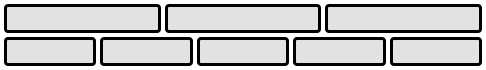
}Because we set grid-auto-flow to row, our grid will look like this. Notice how the three items we didn’t place (item-b, item-c and item-d) flow across the available rows:

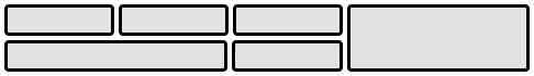
If we instead set grid-auto-flow to column, item-b, item-c and item-d flow down the columns:
.container {
  display: grid;
  grid-template-columns: 60px 60px 60px 60px 60px;
  grid-template-rows: 30px 30px;
  grid-auto-flow: column;
}
grid
A shorthand for setting all of the following properties in a single declaration: grid-template-rows], grid-template-columns, grid-template-areas, grid-auto-rows, grid-auto-columns], and grid-auto-flow (Note: You can only specify the explicit or the implicit grid properties in a single grid declaration).
grid 属性是 grid-template-rows、grid-template-columns、grid-template-areas、 grid-auto-rows、grid-auto-columns、grid-auto-flow 这六个属性的合并简写形式.
Values:
- none – sets all sub-properties to their initial values.
<grid-template>– works the same as thegrid-templateshorthand.<grid-template-rows>/ [ auto-flow && dense? ]? – setsgrid-columns-rowsto the specified value. If theauto-flowkeyword is to the right of the slash, it setsgrid-auto-flowtocolumn. If thedensekeyword is specified additionally, the auto-placement algorithm uses a “dense” packing algorithm. Ifgrid-auto-columnsis omitted, it is set toauto.- [auto-flow && dense? ]
? / – setsgrid-template-columnsto the specified value. If theauto-flowkeyword is to the left of the slash, it setsgrid-auto-flowtorow. If thedensekeyword is specified additionally, the auto-placement algorithm uses a “dense” packing algorithm. Ifgrid-auto-rowsis omitted, it is set toauto.
Examples:
The following two code blocks are equivalent:
.container {
  grid: 100px 300px / 3fr 1fr;
}

.container {
  grid-template-rows: 100px 300px;
  grid-template-columns: 3fr 1fr;
}
The following two code blocks are equivalent:
.container {
  grid: auto-flow / 200px 1fr;
}

.container {
  grid-auto-flow: row;
  grid-template-columns: 200px 1fr;
}
The following two code blocks are equivalent:
.container {
  grid: auto-flow dense 100px / 1fr 2fr;
}

.container {
  grid-auto-flow: row dense;
  grid-auto-rows: 100px;
  grid-template-columns: 1fr 2fr;
}
And the following two code blocks are equivalent:
.container {
  grid: 100px 300px / auto-flow 200px;
}

.container {
  grid-template-rows: 100px 300px;
  grid-auto-flow: column;
  grid-auto-columns: 200px;
}
It also accepts a more complex but quite handy syntax for setting everything at once. You specify grid-template-areas, grid-template-rows and grid-template-columns, and all the other sub-properties are set to their initial values. What you’re doing is specifying the line names and track sizes inline with their respective grid areas. This is easiest to describe with an example:
.container {
  grid:
    [row1-start] 'header header header' 1fr [row1-end]
    [row2-start] 'footer footer footer' 25px [row2-end]
    / auto 50px auto;
}
That’s equivalent to this:
.container {
  grid-template-areas:
    'header header header'
    'footer footer footer';
  grid-template-rows: [row1-start] 1fr [row1-end row2-start] 25px [row2-end];
  grid-template-columns: auto 50px auto;
}
Properties for the Children (Grid Items)
Note:float, display: inline-block, display: table-cell, vertical-align and column-* properties have no effect on a grid item.
Properties for the Children(Grid Items)
grid-column-start grid-column-end grid-row-start grid-row-end
Determines a grid item’s location within the grid by referring to specific grid lines. grid-column-start/grid-row-start is the line where the item begins, and grid-column-end/grid-row-end is the line where the item ends.
Values:
– can be a number to refer to a numbered grid line, or a name to refer to a named grid line - span
– the item will span across the provided number of grid tracks - span
– the item will span across until it hits the next line with the provided name - auto – indicates auto-placement, an automatic span, or a default span of one
.item {
  grid-column-start: <number> | <name> | span <number> | span <name> | auto;
  grid-column-end: <number> | <name> | span <number> | span <name> | auto;
  grid-row-start: <number> | <name> | span <number> | span <name> | auto;
  grid-row-end: <number> | <name> | span <number> | span <name> | auto;
}
Examples:
.item-a {
  grid-column-start: 2;
  grid-column-end: five;
  grid-row-start: row1-start;
  grid-row-end: 3;
}
.item-b {
  grid-column-start: 1;
  grid-column-end: span col4-start;
  grid-row-start: 2;
  grid-row-end: span 2;
}
If no grid-column-end/grid-row-end is declared, the item will span 1 track by default.
Items can overlap each other. You can use z-index to control their stacking order.
grid-column grid-row
Shorthand for grid-column-start + grid-column-end, and grid-row-start + grid-row-end, respectively.
grid-column属性是grid-column-start和grid-column-end的合并简写形式,grid-row属性是grid-row-start属性和grid-row-end的合并简写形式.
Values:
/ – each one accepts all the same values as the longhand version, including span
.item {
  grid-column: <start-line> / <end-line> | <start-line> / span <value>;
  grid-row: <start-line> / <end-line> | <start-line> / span <value>;
}
Example:
.item-c {
  grid-column: 3 / span 2;
  grid-row: third-line / 4;
}
If no end line value is declared, the item will span 1 track by default.
grid-area
Gives an item a name so that it can be referenced by a template created with the grid-template-areas property. Alternatively, this property can be used as an even shorter shorthand for grid-row-start + grid-column-start + grid-row-end + grid-column-end.
grid-area属性指定项目放在哪一个区域.
grid-areas属性还可用作grid-row-start+grid-column-start+grid-row-end+grid-column-end的合并简写形式, 直接指定项目的位置.
Values:
– a name of your choosing / – can be numbers or named lines/ /
.item {
  grid-area: <name> | <row-start> / <column-start> / <row-end> / <column-end>;
}
Examples:
As a way to assign a name to the item:
.item-d {
  grid-area: header;
}
As the short-shorthand for grid-row-start + grid-column-start + grid-row-end + grid-column-end:
.item-d {
  grid-area: 1 / col4-start / last-line / 6;
}
justify-self
Aligns a grid item inside a cell along the inline (row) axis (as opposed to align-self which aligns along the block (column) axis). This value applies to a grid item inside a single cell.
justify-self属性设置单元格内容的水平位置 (左中右)
Values:
- start – aligns the grid item to be flush with the start edge of the cell
- end – aligns the grid item to be flush with the end edge of the cell
- center – aligns the grid item in the center of the cell
- stretch – fills the whole width of the cell (this is the default)
.item {
  justify-self: start | end | center | stretch;
}

examples: ```css .item-a {
  justify-self: start;
}
.item-a {
  justify-self: end;
}
.item-a {
  justify-self: center;
}
.item-a {
  justify-self: stretch;
}
To set alignment for all the items in a grid, this behavior can also be set on the grid container via the justify-items property.
align-self
Aligns a grid item inside a cell along the block (column) axis (as opposed to justify-self which aligns along the inline (row) axis). This value applies to the content inside a single grid item.
align-self属性设置单元格内容的垂直位置 (上中下)
Values:
- start – aligns the grid item to be flush with the start edge of the cell
- end – aligns the grid item to be flush with the end edge of the cell
- center – aligns the grid item in the center of the cell
- stretch – fills the whole height of the cell (this is the default)
.item {
  align-self: start | end | center | stretch;
}

examples: ```css .item-a {
  align-self: start;
}
.item-a {
  align-self: end;
}
.item-a {
  align-self: center;
}
.item-a {
  align-self: stretch;
}
To align all the items in a grid, this behavior can also be set on the grid container via the align-items property.
place-self
place-self sets both the align-self and justify-self properties in a single declaration.
place-self属性是align-self属性和justify-self属性的合并简写形式.
Values:
- auto – The “default” alignment for the layout mode.
/ – The first value setsalign-self, the second valuejustify-self. If the second value is omitted, the first value is assigned to both properties.
Examples:
.item-a {
  place-self: center;
}
.item-a {
  place-self: center stretch;
}
All major browsers except Edge support the place-self shorthand property.
Special Units & Functions
- When sizing rows and columns, you can use all the lengths you are used to, like
px, rem, %, etc, but you also have keywords likemin-content,max-content,auto, and perhaps the most useful, fractional units.grid-template-columns: 200px 1fr 2fr min-content; - You also have access to a function which can help set boundaries for otherwise flexible units. For example to set a column to be 1fr, but shrink no further than 200px:
grid-template-columns: 1fr minmax(200px, 1fr); - There is
repeat()function, which saves some typing, like making 10 columns:grid-template-columns: repeat(10, 1fr); - Combining all of these things can be extremely powerful, like
grid-template-columns: repeat(auto-fill, minmax(200px, 1fr));See the demo at the top of the page about “The Most Powerful Lines in Grid”.
fr units
You’ll likely end up using a lot of fractional units in CSS Grid, like 1fr. They essentially mean “portion of the remaining space”. So a declaration like:
grid-template-columns: 1fr 3fr;Means, loosely, 25% 75%. Except that those percentage values are much more firm than fractional units are. For example, if you added padding to those percentage-based columns, now you’ve broken 100% width (assuming a content-box box model). Fractional units also much more friendly in combination with other units, as you can imagine:
grid-template-columns: 50px min-content 1fr;Sizing Keywords
When sizing rows and columns, you can use all the lengths you are used to, like px, rem, %, etc, but you also have keywords:
min-content: the minimum size of the content. Imagine a line of text like “The very long hotdog.”, the min-content is likely the width of the world “The”.max-content: the maximum size of the content. Imagine the sentence above, themax-contentis the length of the whole sentence.auto: this keyword is a lot likefrunits, except that they “lose” the fight in sizing againstfrunits when allocating the remaining space.fit-content: use the space available, but never less than min-content and never more thanmax-content.- fractional units: see above
Sizing Functions
- The
minmax()function does exactly what it seems like: it sets a minimum and maximum value for what the length is able to be. This is useful for in combination with relative units. Like you may want a column to be only able to shrink so far. This is extremely useful and probably what you want:
grid-template-columns: minmax(100px, 1fr) 3fr;- The
min()function. - The
max()function.
The repeat() Function and Keywords
The repeat() function can save some typing:
grid-template-columns:1fr 1fr 1fr 1fr 1fr 1fr 1fr 1fr;

/* easier: */
grid-template-columns:repeat(8, 1fr);

/* especially when: */
grid-template-columns:repeat(8, minmax(10px, 1fr);
But repeat() can get extra fancy when combined with keywords:
auto-fill: Fit as many possible columns as possible on a row, even if they are empty.auto-fit:Fit whatever columns there are into the space. Prefer expanding columns to fill space rather than empty columns.
This bears the most famous snippet in all of CSS Grid and one of the all-time great CSS tricks:
grid-template-columns: repeat(auto-fit, minmax(250px, 1fr));The difference between the keywords is spelled out in detail here.
Masonry
An experimental feature of CSS grid is masonry layout. Note that there are lots of approaches to CSS masonry, but mostly of them are trickery and either have major downsides or aren’t what you quite expect.
The spec has an official way now, and this is behind a flag in Firefox:
.container {
  display: grid;
  grid-template-columns: repeat(4, 1fr);
  grid-template-rows: masonry;
}
See Rachel’s article for a deep dive.
Subgrid
Subgrid is an extremely useful feature of grids that allows grid items to have a grid of their own that inherits grid lines from the parent grid.
.parent-grid {
  display: grid;
  grid-template-columns: repeat(9, 1fr);
}
.grid-item {
  grid-column: 2 / 7;
  display: grid;
  grid-template-columns: subgrid;
}
.child-of-grid-item {
  /* gets to participate on parent grid! */
  grid-column: 3 / 6;
}
This is only supported in Firefox right now, but it really needs to get everywhere.
It’s also useful to know about display: contents;. This is not the same as subgrid, but it can be a useful tool sometimes in a similar fashion.
<div class="grid-parent">
  <div class="grid-item"></div>
  <div class="grid-item"></div>

  <ul style="display: contents;">
    <!-- These grid-items get to participate on
             the same grid!-->
    <li class="grid-item"></li>
    <li class="grid-item"></li>
  </ul>
</div>
Fluid columns snippet
Fluid width columns that break into more or less columns as space is available, with no media queries!
流体宽度列会分成或多或少的可用空间列, 没有媒体查询!
.grid {
  display: grid;
  grid-template-columns: repeat(auto-fill, minmax(200px, 1fr));
  /* This is better for small screens, once min() is better supported */
  /* grid-template-columns: repeat(auto-fill, minmax(min(200px, 100%), 1fr)); */
  grid-gap: 1rem;
  /* This is the standardized property now, but has slightly less support */
  /* gap: 1rem */
}
Grid 九宫格
<div class="grid">
  <div>1</div>
  <div>2</div>
  <div>3</div>
  <div>4</div>
  <div>5</div>
  <div>6</div>
  <div>7</div>
  <div>8</div>
  <div>9</div>
</div>
.grid {
  display: grid;
  grid-template-columns: repeat(3, 1fr);
  grid-template-rows: repeat(3, 1fr);
  grid-gap: 1rem;
  height: 500px;
}
.grid > div {
  background: #EDE7F6;
  padding: 1rem;
  border-radius: 1rem;
}
body {
  margin: 1rem;
}
Animation
According to the CSS Grid Layout Module Level 1 specification, there are 5 animatable grid properties:
grid-gap,grid-row-gap,grid-column-gapas length, percentage, or calc.grid-template-columns,grid-template-rowsas a simple list of length, percentage, or calc, provided the only differences are the values of the length, percentage, or calc components in the list.
Browser Support of CSS Grid properties
<p>Check <a href="https://codepen.io/matuzo/post/animating-css-grid-layout-properties">this post</a> for more details</p>
<button class="js-button">Animate</button>
<div class="grid js-grid">
  <article class="item">
    <h2>Element 1</h2>
  </article>
  <article class="item">
    <h2>Element 2</h2>
  </article>
  <article class="item">
    <h2>Element 3</h2>
  </article>
  <article class="item">
    <h2>Element 4</h2>
  </article>
  <article class="item">
    <h2>Element 5</h2>
  </article>
  <article class="item">
    <h2>Element 6</h2>
  </article>
</div>
.grid {
  display: grid;
  grid-template-columns: 200px 200px 200px;
  grid-template-rows: 100px;
  grid-gap: 20px;
  transition: all 1s;
}
.grid--full {
  grid-template-columns: 300px 300px 300px;
  grid-template-rows: 200px;
  grid-gap: 10px;
}
button {
  background-color: #123456;
  color: #ffffff;
  margin: 2rem 0;
  padding: 1.4rem;
  border: none;
  border-radius: 5px;
  font-size: 1rem;
}
dt {
  margin-bottom: 0.5rem;
}
document.querySelector(".js-button").addEventListener("click", function () {
  console.log("test");
  document.querySelector(".js-grid").classList.toggle("grid--full");
});
Read more
- Basic Concepts of grid layout - CSS: Cascading Style Sheets | MDN
- 1-Line Layouts: 10 Modern CSS layout and sizing techniques that highlight just how robust and impactful a single-line of styling code can be
- CSS Grid Layout Module Level 2